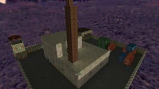
Gasworks Redux
 HLDM
HLDM
Gasworks Redux
by
X-LAyer2
Posted 12 years ago2012-07-23 00:32:40 UTC •
Completed •
Half-Life: Deathmatch
Wow it's been over a year since my last upload. I had a nasty case of mapper's block for most of that time but now I'm back into it.
I originally started creating this map for the mod Hypernova but due to the mapper's block I left the dev team and left the map unfinished.
I created this map with my two major complaints of the Valve original in mind.
#1- The map's layout was confusing and maze-like
#2- The map didn't make any real sense, I got the impression of a factory so that's what this new one tries to work around.
Anyway since I really didn't have anyone to test it besides myself I'd ask you to please tell me of any bugs you encounter. The map has 14 spawn points so playing with more people than that will likely cause problems.
3 Comments
You must log in to post a comment. You can login or register a new account.


Texturing
The texturing is pretty bland, and you have a couple of unfitting and repetitive textures, like this one.
I also found myself in a lot of blandly textures places. You need more details, or anything really.
While different parts of the map have different colors, there isn't a lot of contrast. The skybox left a shadow on part of the building that looks unnatural, but that's about it. Some of the lights looked like they were made with pointlights, but they're passable.
There isn't a lot of ambience that I can recall, but some of your sounds were oddly placed. Like here.
And that's all I have for this review. I'm giving it 3 stars.
I love the little details here and stuff like light fixtures, the rebar coming out of the broken concrete, window trims and the ruptured pipe are all well done, except some of these detail items are proportioned a little strangely, e.g., the window panes are too fat, or the stairway railing is too "tall" on the z axis(up and down), and the y axis is way too skinny.
These are not big deals, especially if this map is more focused on gameplay, but each of these instances is a visual distraction nonetheless.
also, did you do redo the big open underground part? I couldn't find it on my quick run-through, and i feel it was the strongest/coolest part of the original map.
Anyhoo nice work sir, hope to see more from you, i feel this has a lot of potential! =)