passages
Hello guys!
It's been a while since I last posted a map here; been busy with work and such.
Here's one of my latest creations.
First of all, I'd like to say that my friends and I like to play lightning-fast paced maps, usually setting the "Buy time" (the time before round starts) to zero, to keep ourselves from getting bored. Rounds usually last less than a minute.
Well, let's get started on this one.
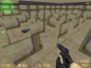
Basically, it's two rooms one in front of the other, with a middle room plagued with small walls for cover. There is also a passage that goes around the map, which has entrances both on the center "room" and at both spawns.
Both teams have MP5s, HE Grenades, and Flashbangs ready to go on their spawns. There are also two MACs at the far sides in the center, two M4s, and a M249 Para plus Kevlar+Helmet on the very center of the field. Buying is disabled on the map to make things more interesting.
Up to 32 players can enter.
Things I know of:
- It's REAAAAALY bad textured, plus it's fullbright.
6 Comments
You must log in to post a comment. You can login or register a new account.

 CS
CS


First off, tell us why is it bad textured, do you know how to use apply texture tool?
Second, full bring, leak? Need any help with that/more explanation?
Or anything else at all, just ask dude, dont be shy.
Secondly, it's full-bright on purpose, but I said it in case someone just comments to say it.
Nah, just looking for some input about if this map layout plays well.
If you just give us a layout that you haven't really tested yourself, you're not gonna get too good of a response.
There's a small problem in the center though. I think I should make the walls higher so that the teams can't see each other at round start.
Frankly, with the map you've got, I wouldn't know what to suggest for the texturing either. Texturing and the architecture should go hand in hand, and with all those thin little walls... yeah, to texture that well, you'd either need to rethink the architecture or have some custom textures and a very creative mind.
And you'd be suprised how much better a non-fullbright map looks, even in you've got enough light to light up everything anyway. If you're still in the testing stage, might be worth leaving til later just to keep compile times down though.