gauss_god_hldm
 HLDM
HLDM
gauss_god_hldm
by
zeeba-G
Posted 11 years ago2013-10-18 16:46:21 UTC •
Completed •
Half-Life: Deathmatch
- Name
- gauss_god_hldm
- By
-
 zeeba-G
 - Type
- Map
- Engine
- Goldsource
- Game
- Half-Life: Deathmatch
- Category
- Completed
- Included
- BSP
- Created
- 11 years ago2013-10-18 16:46:21 UTC
- Updated
- 11 years ago2013-10-22 16:15:14 UTC
- Views
- 3773
- Downloads
- 985
- Comments
- 10
- Rating
- 4.43 (7)
- Reviews
- 0
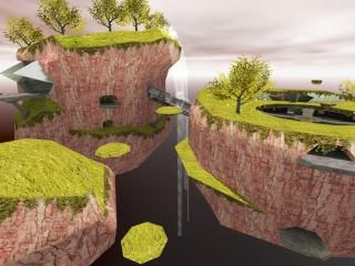
My entry for competition 33, floating island. This will probably be my last big project with goldsource so please enjoy.
-Test in deathmatch to use the gauss and longjump to get around.
-Test in deathmatch to use the gauss and longjump to get around.
10 Comments
You must log in to post a comment. You can login or register a new account.


The outdoor architecture is nicely done, nothing special but I loved the atmosphere. The gameplay should be pretty solid, low-gravity and gauss equals lots of multiplayer fun! However, I believe there isn't much vertical air-space for a gauss gameplay.
I have a few suggestions,
- Try using a clip brush on floating lands, so that the player view models do not appear pitch black when the players stand on them.
- The shadow of the spinning teleporter thing seems to ignore the mid platform's shadows, providing an unrealistic experience.
- I liked the water reflection on the wall! However, I wish you would have blurred the end of the texture a bit for a better effect. (:
- I liked the idea of changing the teleporter's destination with the console and according to which type of music that is playing. But I would refrain from using a globally playing music in a DM map. (The chiptune was awesome though!)
In conclusion, I think the map looks absolutely great and should play great. It just needs a bit more tweaking to be a 5 stars map. (:I ran out of air space because I ran way over on clip nodes and had to clip off the top portion of the cliff wall. It would have also revealed that portion of the map and I couldn't hide it as I was running over on patches as well. It wasn't worth sacrificing the texture sizes as they began to get pretty big.
At least I can blame most issues on the game itself, it's a shame you become black when standing on some entities.
As for the water reflection effect, I agree the edge looks strange but with the angle of scroll it would be impossible to fade it. Unless I made it squared but then it would nullify that the light was causing the reflection.
Thanks for the review!
Btw, did you find the secret? There's a hint in the readme.
Its easy to spot because it differs from others, there is scenery above it. And also an indicator.
I like how you made that hole where the secret is, looks like something im making
Also love the waterfall split.
Awesome map, man!
+ Excellent contruction.
+ Great color sense and textures.
+ Great ambience and lighting.
+ Zappy Cannon.
+ Amazing details, like the butterflies and leaves.
? I don't know why, but it felt like the sky was too low and it felt like it blocked me from going where I wanted to. Noclipping to the top of the big island I immediately thought that something could have been done up there besides what you did.
- A part of the main island with the spinning generator is cut off by the sky box. This happens in a few areas else where too. With the excellent brushwork, I'm genuinely curious why you didn't make the islands more free floating in the skybox.
- The elevator had a purple checker texture in the shaft. Might be just me.
Overall - 5 just because I like it that much.
EDIT: Should have read the previous comments first... lol.
So save some nodes, you could have the bottom portions of the islands, like below the point of no return, have them be illusionary and then use simpler clip brushes to make them solid to players.
To fade out your waterfalls, extend them as far as your max viewable distance is set. They can go outside the skybox, they will still render because a part of them will be visible. At the bottom, VM them into a point, and it will give the illusion that it goes on forever.
@Dimbark, Thanks a lot! What you can see is the secret area, I ran out of time so couldn't hide the area.
@Rimrook, Thanks i'm glad you liked it! I'm glad someone commented on the leaves and butterflies. I got the leaf idea from the fishing pond in Zelda Twilight princess.
Great ideas on fixing the height, maybe someday i'll change it to where you can access the higher areas. I tried making the waterfalls come to a point but it looked odd but maybe if I did extend them further it'd look nice.
@Captain, Thanks! Hope you enjoy it.
Edit: Fixed missing texture