snark_pit remake
 HLDM
HLDM
snark_pit remake
by
Info_Player_IDK
Posted 8 years ago2016-12-05 22:41:30 UTC •
Completed •
Half-Life: Deathmatch
- Name
- snark_pit remake
- By
-
 Info_Player_IDK
 - Type
- Map
- Engine
- Goldsource
- Game
- Half-Life: Deathmatch
- Category
- Completed
- Included
- BSP
- Created
- 8 years ago2016-12-05 22:41:30 UTC
- Updated
- 8 years ago2016-12-05 22:41:30 UTC
- Views
- 2473
- Downloads
- 685
- Comments
- 4
- Rating
- 5.00 (1)
- Reviews
- 0
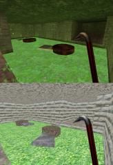
789_diamondisland is a remake of the DM map snark_pit on HL1 for the map remake contest.
4 Comments
You must log in to post a comment. You can login or register a new account.


Really the fun colors and textures exuberate with charm! I can't quite put my eye on it but something seems familiar, haha.
The palm tree leaves are a little flat. You can use angled brushes to add some volume to them. PM me if you'd like an example.
One of the bases has a side corridor you can't get through as it's too narrow.
Lighting please. Even if the outside ends up just as bright (which would be fine) the tunnels underneath are painful on the eyes.
Strafing seagulls!
Otherwise, you've got a good little map here. Touch it up a bit and it'll be great.