Sabotage
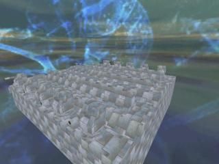
ive been working on this map for a long time. basically, your objective is to sabotage a small convoy of transport spaceships. a few things to go over.
1. BIG thanks to PTS for the texture.
2. when the map loads hl will take the size in vid modes down, so put it back 2 your seting when it starts.
3. the small ship at the left side is a drone controllled by the middle ship. just to avoid any questions.
4. to play just unzip it and put the bsp and wad into the valve/maps folder.
5. give me feedback!
27 Comments
You must log in to post a comment. You can login or register a new account.

 HL
HL


1. Space has no light. It should be pitch black outside the ships.
2. How is gordon breathing outside the ships?
3. The ships textures are really bad. Add some diversity or change them altogether.
4. The ships are too unrealistic. Add some engine exaust pipes or something. Make it look like the thing could actually fly.
Then you've got a good little mod.
Bad designed spaceships. Bad texture usage. R_speeds are way too high for such an undetailed environment, so I'd say it's overall bad designed. No challenge in the fights too (Gauss versus grunts...).
The whole map didn't convince me. The only way I saw it was in space was the sky, and somewhat the shape of the spaceships. It's a nice idea IMO, but worked out very meagre.
It's Xen? As I said before, it doesn't convince me. It has a very weak atmosphere. If a player can't see it's Xen after 10 minutes, the level has a bad sense of place.
Oh, and the wind sound was very, very annoying...
Well, I didn't really like it. Visually of low quality, and there wasn't really a clue in it altogether. When you pressed that button, a spaceship came near so you could jump on the heavy spaceship, right? And then? Is that the end? Pretty lame. Let us at least know when it ends. Even better, give it a satisfying end, like you actually acomplished something. For example, make the player escape on the small spaceship.
BTW, how did that little door to the 'control room' open? I had to noclip trough it...
There's some little button somewhere to open that door - cant remember where.
And, on the end space ship (teh heavy one) shoot the last/first of the cannons - they will kapboom.
Look, funny idea, but who knows they're destructible? It's not obvious. At least give us a hint. In HL, you always knew what you had to do. Here, I don't had a single clue...
Oh, and I still didn't find that little button... very annoying. Being stuck in an area really hinders the gameplay.
There's is one: good concept! Keep it up!
I read for the textures, but I don't really get it. Do you want me to do a scrolling sky texture? It's normally impossible and a normal texture so stretched will be ugly or will produce high r_speeds. Custom textures for each ship sounds accomplishable and I'll make you some sprites that will make your level look good.
I see that people don't like your space... do you need a good example of space map? Or at least good form for the ships?
Let me think... you damage the drone wich causes a warning on the medium ship so the control rooms door opens, right? Then, you control the drone to get into position between the medium and the large ship, then you destroy the large ships small defences. Right.
I like the idea. But... your level requires people to know that they have to damage the drone. And that's definitely NOT obvious in this level. After defeating the grunts I had no single idea how to open that door. I wouldn't think of shooting on an object nearby as it seems that can have no influence on a door in another ship. It's not logical. Besides that, the door looks more like a vent entrance than a control room door. But that's just the look and not the gameplay. I suggest making it either more obvious and clear to the player or give him tips with text messages. Although the first option would be better.
I must admit that the crack decal does give the player an identification that these guns can be destroyed. That's a good sign towards the player.
OK, I get the point the level has to continue. OK, succes with it!
Make the path the player has to follow (e.g. the things he has to do, how he can proceed) a bit more obvious to take away the confusion about 'what am I supposed to do?'.
Oh, and beware face splitting. Those little lamps on the walls split up the walls into a lot of faces. Make these little lamps entities.