Commented 17 years ago2007-06-16 10:24:23 UTCComment #15111
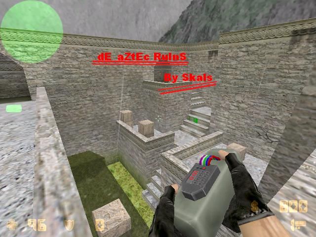
I'm not trying to be mean, but your last sentence "If you gona ask if its full bright. no stop being stupid." means you are unhappy with the lighting and you're aware that it doesn't really offer much visual contrast. The screenshot alone tells me this layout is a solid improvement over your previous cs maps, as I see height variation, areas blended with each other etc. I don't have CS installed so I can't make a proper review. Keep it up!
Commented 17 years ago2007-06-17 13:23:57 UTCComment #15123
sigh Ghetto, stop bitching, these people here want to help you. The map is not bad, but a little stock, try an original theme next time. Dust, chateau and now aztec? Use you're imagination. And stop being an arse.
Commented 17 years ago2007-06-17 14:23:16 UTCComment #15124
wat do u meen use my imagination? oll of my maps come from my imagination... and their starting on me just because i said 'dont say "is it fullbringht?"' because like in every map on the forum they usualy ask that. should i just take a pic of a big shadow? or should i take a pic of the good bits from the map...
Commented 17 years ago2007-06-17 14:34:09 UTCComment #15126
If you want tips on the lighting, just learn to use a light_spot and a info_target entity, then you can move the target around to easily adjust the direction of the sunlight and play with the direction you like best. From the pic it looks like the sunlight is coming straight down to me.
Commented 17 years ago2007-06-17 16:14:25 UTCComment #15128
Do you actually read a sentence, before you anwser, or just take out a word, and pick on it?
The THEMES are stock, overused, the maps may have good architecture, but come up with an original theme next. It's a bit boring to see well-known themes, just with a different setup. I think it's ok to make 1 or maybe 2 maps with an old CS theme, what you really like, and can't stand to make you're own, but in you're case it's just starting to get boring.
Commented 17 years ago2007-06-18 03:42:34 UTCComment #15133
These people give you constructive criticism and you start flaming them like a bloody imbicile.
What we're trying to say is that your map has <u>dull and boring lighting</u>. Because of <u>dull and boring lighting</u> - it <u>looks like</u> fullbright. Instead of whining like some fucking 5-yr-old primadonna every time you hear the word fullbright, improve things. It doesn't matter how good your architecture/texturing is, if you only bother adding one light entity with 255 brightness, pointing directly downward in the end. A map with no good lighting is NOT a good map.
Commented 17 years ago2007-06-20 04:59:24 UTCComment #15157
Probably...
"...this is about my map not a tutorial..."
Que? You make no sence, kid. ITS A TUTORIAL, TUTORIALS ARE MEANT TO TEACH YOU THINGS, BETTER LIGHTING, FOR EXAMPLE! Did you actually bother to take a look at those tutorials, or are you just ignoring everything we say?
The screenshot alone tells me this layout is a solid improvement over your previous cs maps, as I see height variation, areas blended with each other etc. I don't have CS installed so I can't make a proper review.
Keep it up!
Tutorial: Environment
Tutorial: Light
Should be enough to shed some light on your maps.
Is that fullbright?
The THEMES are stock, overused, the maps may have good architecture, but come up with an original theme next. It's a bit boring to see well-known themes, just with a different setup. I think it's ok to make 1 or maybe 2 maps with an old CS theme, what you really like, and can't stand to make you're own, but in you're case it's just starting to get boring.
Is that fullbright?
What we're trying to say is that your map has <u>dull and boring lighting</u>. Because of <u>dull and boring lighting</u> - it <u>looks like</u> fullbright. Instead of whining like some fucking 5-yr-old primadonna every time you hear the word fullbright, improve things. It doesn't matter how good your architecture/texturing is, if you only bother adding one light entity with 255 brightness, pointing directly downward in the end. A map with no good lighting is NOT a good map.
Grow the fuck up already, sheesh.
So, is that fullbright? ;p
"...this is about my map not a tutorial..."
Que? You make no sence, kid. ITS A TUTORIAL, TUTORIALS ARE MEANT TO TEACH YOU THINGS, BETTER LIGHTING, FOR EXAMPLE!
Did you actually bother to take a look at those tutorials, or are you just ignoring everything we say?
So here they are again:
Tutorial: Texture Lighting
Tutorial: Environment
Tutorial: Light
Read!
Learn!
Adjust!
Update!