New Old Home
 HL2DM
HL2DM
New Old Home
by
Soup Miner
Posted 15 years ago2009-07-19 16:23:03 UTC •
Completed •
Half-Life 2: Deathmatch
- Name
- New Old Home
- By
-
 Soup Miner
 - Type
- Map
- Engine
- Source
- Game
- Half-Life 2: Deathmatch
- Category
- Completed
- Included
- BSP
- Created
- 15 years ago2009-07-19 16:23:03 UTC
- Updated
- 11 years ago2013-07-19 04:14:57 UTC
- Views
- 3578
- Downloads
- 1183
- Comments
- 8
- Rating
- 3.00 (1)
- Reviews
- 0
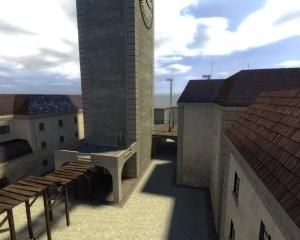
As the epitome of my recent obsession with Haibane Renmei without actually remaking places from the show, I decided to build my competition 27 map in light of "Old Home". But you don't have to look at it that way, of course.
It's my first real, completed Source map and I'm very proud of the results.
Everything is included in the bsp, which is why it's so large.
It's my first real, completed Source map and I'm very proud of the results.
Everything is included in the bsp, which is why it's so large.
8 Comments
You must log in to post a comment. You can login or register a new account.


However, my original point stands:
There is literally not a single physics prop in the entire map. Not one.
Well, actually, even weirder, there are some, but they're set to motion disabled.
why?!
The thing that makes HL2DM any different from any other game is the gravity gun. You didn't ignore that entirely, leaving weapons out of reach so that they require being pulled into the playing field by the grav gun, but there is no place it can be used for combat.
This also makes the whole map just seem... fake.. Plant pots that won't break, and stuff. Just odd.
The biggest annoyance is being raped in the face by invisible walls, and I really worry that that will cost you in the competition results. It seems lazy to mark out the layout with nothing more than a rope and a playerclip.
I guarantee that any non-mapper who played it would immediately rage about the invisible walls.
Also, in Source, 3D skyboxes are generally a must-have in all maps, but to be honest - just having the nice wind turbines in the foreground is good enough in this case.
Lastly, this is a WCD map. Where is the obligatory secret room?
3 stars, but only because i know you will improve greatly and rapidly, and i want you to know how much of a difference i feel there is when i rate your next map higher.
As for no physics props, it's because the map wasn't really built with gameplay in mind to begin with. The competition is supposedly based on visuals with "gameplay being nice but optional".
You're right, though. Had I built it with gameplay in mind, all those motion-disabled physics props WOULD be grabbable. But I put them there for visual aesthetics, and as such, I didn't want them to go anywhere.
It would be a real shame if it cost me any award because I neglected gameflow in a competition about eye candy.
Edit: What I'm trying to say is that I wanted to build a very clean map with a clean theme. And I guess that makes it feel barren from a gameplay point of view, but heavy physics props littering the ground everywhere would only hurt the "peaceful" feel that I wanted from the beginning.
And that reminds me that I forgot to put the pipes on the last two buildings that are missing them.
I love the design and the interior section is very nicely constructed. I do agree with huntey the outside areas are quite barren and unnaturally empty, and also too about the lack of phsyics props and the invisible walls issue.
I also get a weird hdr reflection off all the weapons and static props, as well i see the aaa texture on pole part of the windmills. Besides those, and the lack of detail items outside, this is a really nice-lookng work imo, which i would expect nothing less from world crafter.
since i am a total noob at source mapping, i don't really feel right about rating, so i won't. in my noob i would rate a 4 probably, or withhold it until you make improvements, as i would probably disable ratings altogether for my first map in a new engine.
Nice map and compo entry bravo!