Chicco's Bedroom 2
 HLDM
HLDM

Chicco's Bedroom 2
by
Zemek
Posted 13 years ago2011-02-24 08:43:14 UTC •
Completed •
Half-Life: Deathmatch
Loading...


Map of the Month winner for February 2011!
Hello, now it works, I recompiled with the correct file WAD!
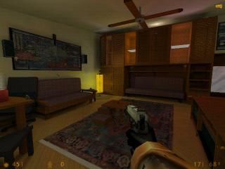
This is the second version of the bedroom of my friend Chicco!
Added some elevators, new textures and a secret passage...
Have fun!
Zemek
This is the second version of the bedroom of my friend Chicco!
Added some elevators, new textures and a secret passage...
Have fun!
Zemek
6 Comments
You must log in to post a comment. You can login or register a new account.
++Architecture- You did really good with this, everything looks so real.
++Ramps- Adding ramps was a rather good idea, it made the map more fun.
--The Elevator- It was rather dark in that area, and if you stood by it, it quickly took down your health. Also, the side of it looked a bit stretched.
Thanks for the suggestions!
Zemek
That said, i noticed a couple distractions right away:
-the fan is not shaped like a real fan. google image a ceiling fan and make it look right. i.e., rotate the blades, shape them more creatively, etc..
-If the big thing on the dresser with is supposed to be a flat-screen tv, add a couple simple things to actually make it look like a tv screen, like make the screen itself an illusionary glass texture, and put the tv image underneath it on a seperate brush. make that seperate brush a textlight, so the thing appears backlit. you may have to leave some space between the glass and the texlight for the light to shine through, i'm not sure. This same exact effect applies to the computer screen.
-no sound at all. through some speakers on by that pc and pump some music, an youtube video, ANYTHING =)
-clutter up the floor a little bit to make the room look more lived in, with some clothes, take out containers, bookbag, etc.
Again great map, but not noticeably different from the first one afaik, so again, 4 stars. this map is easily 5 stars with a little extra loving..
= )
p.s. i would love to offer help to build some props for your map if you need any.. i would love an excuse to map something for goldsrc again..
Texturing — 7.5
Ambience — 6
Lighting — 8.5
Gameplay — 8.5
Video Review
Bottom Line
It might just be the nostalgia talking, but this map has just fallen short in my view.