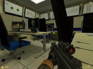
DPC Ced Office
 HLDM
HLDM
DPC Ced Office
by
Zemek
Posted 13 years ago2011-09-05 15:04:06 UTC •
Completed •
Half-Life: Deathmatch
- Name
- DPC Ced Office
- By
-
 Zemek
Zemek - Type
- Map
- Engine
- Goldsource
- Game
- Half-Life: Deathmatch
- Category
- Completed
- Included
- BSP
- Created
- 13 years ago2011-09-05 15:04:06 UTC
- Updated
- 13 years ago2011-09-05 15:04:06 UTC
- Views
- 2220
- Downloads
- 667
- Comments
- 8
- Rating
- 4.67 (3)
- Reviews
- 0
Hello my friends, this is my new office!
I am working to complete the map. Leave your comments, thanks.
See you soon, Zemek.
I am working to complete the map. Leave your comments, thanks.
See you soon, Zemek.
8 Comments
You must log in to post a comment. You can login or register a new account.


Well this is one hell of a map.. The architecture it impressive and so is the quality of the textures... You did an awesome job here.. This is probably the best deathmatch map I've ever seen but I'm not a regular DM player I'm sure I've missed a lot.
Never the less it is brilliant.. Also the lightning fits very well here.
Take a look at it people you wont regret it.
Contra: It is a bit quiet in this room. Perhaps add a rhythmical custom computer summing sound in. Not sure though if custom sounds are any good for DM maps.
Not sure why you textured the entire map even in places where the players can't get to or see to.. I would make use of the null texture in those areas.
Ideas: Add a trap for the players to play with somewhere. Maybe behind the table etc. There are many possiblities you could choose from. Rat trap or a dose falling down etc.
Perhaps create a brush based jacket for the clothes rack. At this scale there shouldn't be any brush errors. As for a suitable texture guess it will become a lot harder.
Way to go really lovely map. I can't really judge regarding the placement of the weapons and ammo 'cause I'm not a regular DM player but it seems decent.
@DiscoStu, yeah, that's what I thought too but when I played the map I learned it was a "de_rats"-style map. The player is actually standing on the desk in the screenshot.
Aight, on with what I have to say about the map.
+ Nicely designed, a lot of details and good use of transparency.
+ Nice textures, I like how the screens have different motives and even the mouse pads have different colors. That's cool.
+ Nice lighting
+/- No sounds, actually did not bother me so much on this map.
+/- Some glitchy looking brushes - the monitor stands.
-- r_speeds are crazy high in a lot of places. Over 5000 wpoly, which leaves me with around 30 fps and thats when I'm playing alone! It's hard to do efficient VIS-blocking in this kind of map (since it's only one big room) but smarter texture scaling and less brush details (textures instead) and use of func_wall will reduce your wpoly count quite much on this map.
Over all good work, but for me it's just painful to see something nice like this and it's just barely playable. Four stars.
Looks really good, downloading!
Continue to leave your comments and suggestions are very important!
See you soon, Zemek.
++superb texturing
+excellent architecture
+creative use of transparent textures (the office chairs)
+well-made jump assist
+weapon placement
+cover
+/-very high r_speeds for a mp map, but who knows might run ok?
-no sounds nor ambience?
I need to say first this is a fantastic-looking rats map, one of the best i've probably ever seen. good texturing is crucial in a rats map to make them look believable, and you've come through in spades on that front.
At first i didn't think there was enough cover in the map, but there are nooks and crannies everywhere to hide, even though the main map is very open (as with most rats maps).
No commplaints really besides there should be some sounds. fan sounds by each pc monitor, radiator clinking under the table, random "mouse" chirping in the mouse tunnel areas, all would add much to to player's immersion in the map.
r speeds are pushed to the limit in this map, but who knows, it map play smoothly. have you tested it at all on a server?
If you ever revise the map and are looking for ideas of how to change the map, please pm me, as i have tons of ideas for this map. =)
P.S., you need to contact potatis invalid and get this map on the hldm server!
All in all, a superb rats map.
5 stars.