2Partment
 HLDM
HLDM
2Partment
by
ThatGuy4878
Posted 11 years ago2013-01-07 04:56:03 UTC •
Completed •
Half-Life: Deathmatch
- Name
- 2Partment
- By
-
 ThatGuy4878
 - Type
- Map
- Engine
- Goldsource
- Game
- Half-Life: Deathmatch
- Category
- Completed
- Included
- BSP
- Created
- 11 years ago2013-01-07 04:56:03 UTC
- Updated
- 9 years ago2015-10-20 18:41:10 UTC
- Views
- 2503
- Downloads
- 5773
- Comments
- 11
- Rating
- 3.00 (1)
- Reviews
- 0
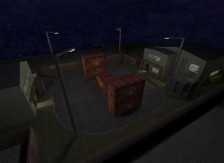
So, many of you know me from a little debacle that happened over two years ago when my really bad map "Apartment" won the Map of the month award of March 2011; an award, I might add, I never wanted in the first place.
Well, fast forward to the now and you've got me remaking the only thing I'm really known for here.
You might remember the old apartment being that nonsence floating block on top of another block of a map, but now there are two of them. Heck, they aren't even apartments - just houses in the middle of a desert for absolutly no reason. Screw back-story! Apartment laughs in the face of people trying to make sence of things that didn't want to be realistic in the first place!
The main thing I focused on when making this thing was 'Map Flow', a trait that the orignal map failed at (amongst other things). Now there is three ways in or out of a room, windows allow for getting around the outside of a house in record time and there are ladders up to exterior windows that allow for endless possabillities of getting around the two hous- cough apartments.
Don't expect the archetecture to be any better, though. My brushwork is still very bad :P. Blocky toilets ahoy...
This map is not supposed to be the most pretty, but the most fun. I playtest this map with a couple of friends, and we played for hours without getting bored, so at least for me, dispite how many of you dislike the map, my mission is already accomplished.
I geuss I should really shut up and let you download it. So, go ahead

11 Comments
You must log in to post a comment. You can login or register a new account.


This does not seem right...
As for the map i like it a lot! Solidly designed and clean, but man, do your best to get off the original textures!(i wish i would have taken this advice as a new mapper!)
Really, the HL textures and skies are basically shit compared to newer high res texture packs(the computers today are way better so you have more leeway then the original devs had). do yourself a big favor and download some fresh wads! =)
Anyhoo, nice work!
Im going to upload a new version of the map which incudes many more features that will make the map better gameplay wise, such as solving some clip brushes and adjusting a few things.
Still comment and rate, though, and if you have any suggestions (besides how boring the default HL1 textures are) I'd love to hear them ^_^
5127 downloads
....
Welcome to the Twilight Zone...
It is blocky, it is ugly but it seems it would be very fun to play with friends. Silly maps like these, always provide the best amusement with your friends.
If possible, do not put many func_breakables in a HLDM, it is not CS.
Considering your first apartment map, 2Partment is an excellent improvement.
You definetly took the comments seriously and fixed the most troublesome issues, which is awesome!
+ I liked the extra entrances and exits, in the buildings. Good call.
+ Lighting is alright, ambience is alright. Nothing special.
+ Gameplay probably would be good.
- Very blocky, but I'm sure you'll improve in time. Try to learn more about the clipping tool and vertex manipulation.
I was going to rate the map 2 stars but I believe your thought process and consideration of the old reviews, makes it deserve one more star. It is good to see new mappers, who are taking the suggestions seriously and delving on them. Also, after seeing your older maps. I think you could have made this map a lot better.
Note: Jetmoto.. blast from the past..haha
Not that anyone would go back after 2 years to play this again, but hey, it's something.