Competition: Map From Another Layout
Closed
View Results
- Open Date
- 15 years ago2009-06-06 00:00:00 UTC
- Close Date
- 15 years ago2009-07-19 23:59:59 UTC
- Type
- Map from Base
- Allowed Engines
- Goldsource, Source
- Judging Type
- Judged (all engines combined)
- Judges
It is competition season again, and due to popular demand we're bringing back another layout compo!
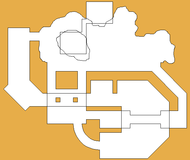
Your goal is to create a singleplayer or multiplayer map based on the layout at the top of the page. This competition will be based almost exclusively on looks and creativity with the layout.
It will be judged in an extremely liberal manner.
This layout is meant to represent the walkable portion of the map only. Extra stuff can be added for cosmetic purposes as long as the player cant walk on it. The map can take place indoors, outdoors, underground, or anywhere.
You may blow proportions out of scale compared to the picture if you want, but the general floor plan has to be there.
The walkable floor space of the map has to follow the layout, but not necessarily how that is accomplished. The curved section doesn't have to be a pure curve for instance, but rather an open space with obsticals that make the player take a generally curved path. On topic with the curve, diagonal hallways dont have to follow their perfect 45 degree angles if it contributes to the map in a beneficial way.
The map can look like anything, but the walk-able floor space must reflect the layout. The bumpy natural line at the top of the layout can be a beach-front into an expansive ocean, you'll just have to kill the player before he can get too far into the water and away from the layout.
The heights may also be interpreted in any way you see fit. The bridge with the two cut-out holes could be only a step up from the floor around it, or a straight hallway could be a ramp.
Gameplay is welcomed, but optional.
Just follow the general room plan, make sure the room connections line up, and you'll be fine; We're not layout nazis afterall. An amazing looking map wont get disqualified because the curvy bit wasn't a perfect curve.
The entries will be judged by Penguinboy and TheGrimReafer.
You've got a little over a month to get an entry together. Go!
Results
Judged By:
 TheGrimReafer
•
 Penguinboy
•
 Daubster
Finally, we have the results of the 27th TWHL competition! Big thanks to TheGrimReafer for doing the reviews time time round.
We have three Goldsource winners this time, and a lot of good quality entries, so it was hard to choose the top three! Congratulations to all the winners!
What I found really cool with this competition's entries is the sheer amount of variety in the maps. In the winners alone, we have a firey lava castle, a snowy military base, and a watery industrial type setting. Very colourful and creative!
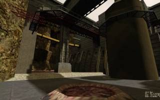
What sets this entry apart from the others is its level of what I'll call 'completeness'; There's so much to take in from so many angles. The scale alone deserves a trophy. It has some of the best VM i've ever seen on top of some interesting water usage. The lighting and ambience also contribute heavily to its industrial theme. It's clear a lot of work went into this entry. Well deserved.
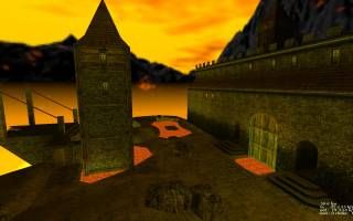
This entry was a very close second place. The castle was done incredibly well. The textures and skybox were perfectly chosen to suit the theme of the map. The texturing in combination with the lighting and ambience came together to create an awesomely clich? castle. The only thing missing was evil pipe organ music. Aside from a few texture alignment problems and some lava resistant wood, this map was extremely solid.
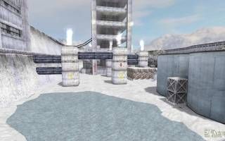
The snow in this entry was a great change of scenery from the normal. The blocky architecture, which is bad under normal circumstances, did help contribute to the 'cold' atmosphere of the scenes. There were also several subtle and small details such as icicles and "concrete to snow" fading textures that helped to immerse the player. The ambience was good, although the steam sounds indoors were a little overbearing. I know its supposed to be windy, but the moving puddle outside looks out of place. The abundant use of orange decals outside also detracted from the theme.
- tetsu0 -
- Muzzleflash -
- Rufee -

- WorldCrafter -
- IMUS -
- DocRock -


