Competition: Floating Island
Closed
View Results
- Open Date
- 11 years ago2013-09-14 00:00:00 UTC
- Close Date
- 11 years ago2013-10-17 23:59:59 UTC
- Type
- Full Map
- Allowed Engines
- Goldsource, Source
- Judging Type
- Judged (all engines combined)
- Judges
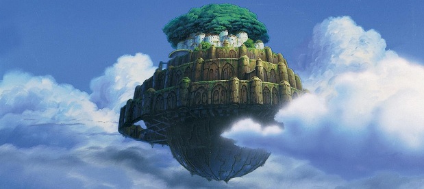
Your task is to create a map located on a floating chunk of land. You can make anything as long as the map is suspended in mid-air.
We will be looking for usage of vertical spaces and "over the edge" vistas to remind the player that they are not on the ground. Entries should make use of the floating motif; It shouldn't be a normal map that just happens to be in the sky.
Visit the official thread for any questions.
Good luck!
We will be looking for usage of vertical spaces and "over the edge" vistas to remind the player that they are not on the ground. Entries should make use of the floating motif; It shouldn't be a normal map that just happens to be in the sky.
Visit the official thread for any questions.
Good luck!
Results
Judged By:
 Penguinboy
•
 AJ
AJ
Well, it took a while, but the results are finally in! We got a good range of entries this time around, from veterans and beginners alike. It was very fun to play all the entries and see what you all came up with.
Designing a floating island meant your imagination could go wild, and our entries didn't disappoint! A great selection of wild, fantastical were sent in for this competition, making judging yet again a tough gig. Congratulations to our winners and all those that submitted an entry!
Designing a floating island meant your imagination could go wild, and our entries didn't disappoint! A great selection of wild, fantastical were sent in for this competition, making judging yet again a tough gig. Congratulations to our winners and all those that submitted an entry!
- Penguinboy & AJ
AJ
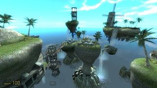
Floating islands are meant to be ethereal, fantastical places, and this is the perfect example of it. This is pure spectacle: while there's no gameplay to speak of (unfortunately), the atmosphere is second to none. Tall, cascading waterfalls, beautiful expansive vistas and some wonderful attention to detail. It completely nails the competition theme, making it the well deserved first place entry.
Penguinboy
Moaby's entry had a very cool "infinite ocean" feel to it that I really like. The environment and the floating islands themselves were nicely made, with some good effects and sounds for the waterfalls. It felt like a scene straight out of the Myst series, though it could have been improved with a detailed 3D skybox to show an increased sense of scale in the world. Gameplay would have been very good to have, or even a proper path of progression through the map (noclip had to be used instead) would have improved the experience quite a bit.
AJ
This is a fantastic interpretation of the competition brief. The running water spilling over the floating pockets of land give it a brilliant, otherworld feel. Best of all, the lowered gravity along with excellent use of vertical space makes for some highly amusing gameplay: I was strongly reminded of the madcap craziness of Unreal Tournament.
Penguinboy
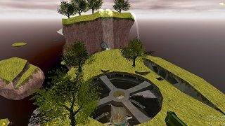
Zeeba-g shows us his love for the gauss gun in this low-gravity HLDM entry made specifically for the weapon. The gameplay on this map is certainly quite enjoyable, though the map is quite unbalanced. The gameplay style of the gauss gun means that players tend to gravitate towards the open area on the main island and ignore the rest of the map, which is disappointing as the entire map is well-made. The some areas seemed a bit too heavy on the grass textures - it would have been nice to see some extra texture variation in those regions.
AJ
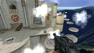
Another gorgeous map, and another map for Half-Life Deathmatch! A sort of floating persian palace, the map also features some rather interesting quirks (the giant, rotating disk used to reach the RPG is brilliant). Well worth a run or two with a couple of mates.
Penguinboy
DocRock once again shows us another great HLDM entry that nails most of the expectations of a deathmatch map. Nice architecture, textures, weapon spawns and detailed areas can be seen throughout the map. While it could use some additional polish, it is a well-rounded map in all areas. The RPG is far too difficult to get when you have server lag, however. A few odd texture choices detract from the classiness of this otherwise excellent map.
Lost in Transmission – Tetsu0
AJ
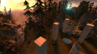
No, not a retelling of a certain Japan-oriented romp with Bill Murray and Scarlett Johansson. This is a short, puzzle-based Episode Two map with a fantastic aura to the landscape and structure design. I didn’t quite get the impression that it was a floating island though (the landscape seemed to be rising out of water, which would make it more of a mountain in my mind), which knocked this map out of the top three. Still, a fantastic effort from Tetsu0.
Penguinboy
Tetsu0 takes the Myst theme that Moaby used and took it a bit further by adding some gameplay and exploration. While there was really only one proper puzzle in this short map, the exploration in this entry resonated with me. Displacements are used well, though it would have been nice if the surface of the main island wasn't so flat - the theme allows for some creative terrain use that I felt could have been used more effectively in this entry. Addition of a 3D skybox was nice, however some more refined texture and geometry use within the skybox would work wonders. I would love to see more puzzle-type maps on TWHL!
Cloud Factory – doodle
AJ
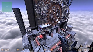
dewdle let his imagination run rampant in this Counter-Strike: Source map. Set in a steampunk-ish world (Dishonoured springs to mind), the map is a hazardous collection of walkways, pipes and giant gears. A wonderful interpretation of the brief, with only a bit of a quality tune-up needed to really drive it home.
Penguinboy
Dewdle's entry has a complex mechanism of cogs moving about in the top half of his map, which supposedly run the map's titular cloud-generating factory. The general feel of the map is nice and one thing I really enjoyed (though I don't think it was intentional) was that it was daytime in the upper areas, but seemed like it was night in the lower regions of the map. Gameplay-wise, the map seems quite cramped and some odd decisions (weapon spawns in CS?) detract from the experience.
Orbit – Captain Terror
AJ
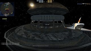
Personally, I loved this map. If there’s one thing I miss from the Goldsource days, it was the more outrageous maps that were released for it. This map for Counter-Strike: Global Offensive is right up there in ridiculousness: set on a giant asteroid, it features an orbiting space shuttle and quite a labyrinth of a space base. Unfortunately, it’s perhaps a little too ridiculous for CS:GO’s gameplay: a far smaller, tighter version would certainly make this map a winner.
Penguinboy
Captain Terror just squeezed his CSGO entry past the competition deadline, and it shows, as the map is quite incomplete. The concept and setting is a neat idea - the map is set on a space station, with the terrorists boarding from a shuttle. The map is quite large and has a lot of open space, which means that the gameplay quickly degrades into a sniper battle. The close proximity of the two bomb sites also detract from the gameplay experience. I'm not sure that having the shuttle rotate around the station is a good idea, as moving objects in multiplayer never turns out well.
The Stupendous Quest of the Annoying Microwave – NineTnine
AJ
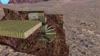
Case in point with what I was talking about for Orbit: crazy, surreal Goldsource maps. A team of headcrab guides? Check. A non-sensical quest to discover a bizarre item (a microwave, no less)? Check. A short, but amusing map.
Penguinboy
NineTNine shows us that competitions can still have a lighter side with this humourous Goldsource entry featuring a wise headcrab and a quest for a magical microwave. While it's obvious that this entry was not intended to win, it does get a special award for making me laugh. Good job!
Floating Paradise – HalfLifeRules.
AJ
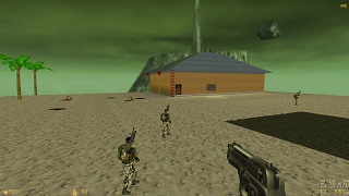
Up for a bit of a challenge? A nice combat-oriented map is what greets you here. It’s a little sparsely detailed, but a great effort from first-time entrant, HalfLifeRules.
Penguinboy
Beginner mapper HalfLifeRules submitted one of the few maps with gameplay in this competition. The first thing that I noticed with this map is the issues with draw distance - since the map was so large, regions were being clipped by the renderer during play. This can be avoided by adding walls and other obstacles to block visibility of far-away areas. This entry could be improved by adding some more details to show that you are on a floating island - it isn't immediately noticeable when you first play the map. I'm looking forward to seeing more work from HalfLifeRules in the vault!

