Competition: Half-Life 25th Anniversary: Vanilla HLDM
Closed
View Results
- Open Date
- 1 year ago2023-11-29 00:00:00 UTC
- Close Date
- 11 months ago2024-01-17 23:59:59 UTC
- Type
- Full Map
- Allowed Engines
- Goldsource
- Judging Type
- Judged (each engine separate)
- Judges
Most of us just expected Half-Life's recent 25th Anniversary to pass by just like all the other anniversaries: the community cheers/grumbles a bit but Valve is absent and silent. But not this time!
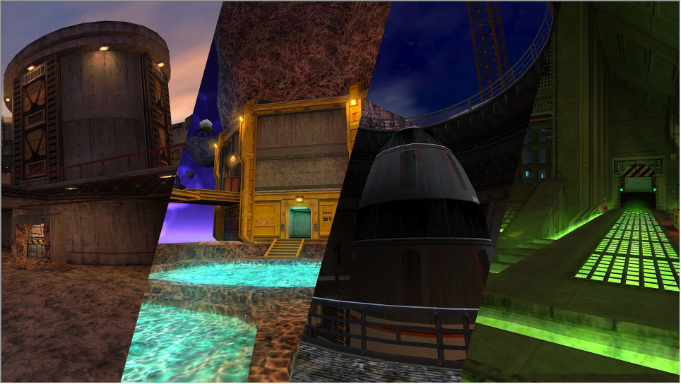
Out of nowhere, Valve dropped a major update for Half-Life - including 4 all-new deathmatch maps from Valve level designers! Check them out if you haven't - there are usually hundreds of servers online these days!
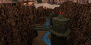
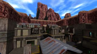
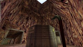
So we're celebrating the updates and the renewed love for HLDM with a competition! Make an all-new Half-Life deathmatch map, staying as "vanilla" as possible. That is, stay in the Half-Life theme for the map (standard textures, locations, ambience, etc.). But also don't be afraid to push the engine beyond the 1998 limits. Poke around the new HLDM maps for an example of modern maps that are still in the vanilla theme - contamination, disposal, pool_party, and rocket_frenzy.
For this competition your entry must consist of the BSP file only. That means custom textures (wadincluded) are allowed, but you can't use any other custom content. The goal is to make something as "vanilla" as possible, so if you do use or make custom textures, they should fit in with the other standard Half-Life textures.
Need playtesters? (Highly recommended, by the way!) Hit up the TWHL Discord server and you'll probably find people willing to jump in and try out your map!
Entries close January 17th, 2024.
Note: to submit an entry, make sure you're logged in to TWHL and the submission form will be visible after the prizes below.
Post any questions, comments, or in-progress screenshots to the official forum thread.
Update: Yes, func_vehicle is allowed - but not encouraged given its jankiness. Not adding func_vehicles won't adversely affect judging of the map, particularly because this is a "vanilla" theme.
Prizes
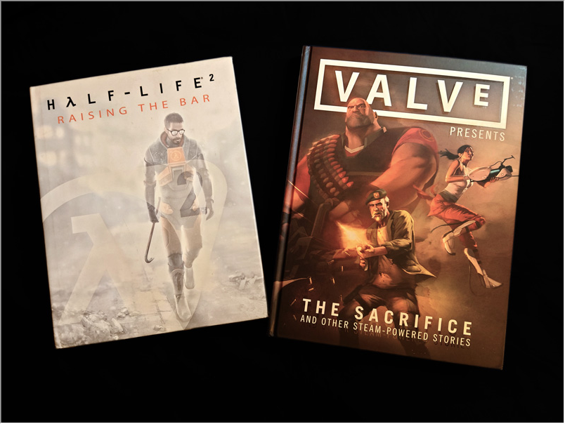
- First Prize: The one, the only Half-Life 2: Raising the Bar book from 2004 and now out of print (excellent condition).
- Second Prize: Valve Presents: The Sacrifice and Other Steam-Powered Stories book (excellent condition).
- Third Prize: $25 USD Steam Gift Card.
Results
Judged By:
 Unq
•
Unq
•
 Penguinboy
•
 Strider
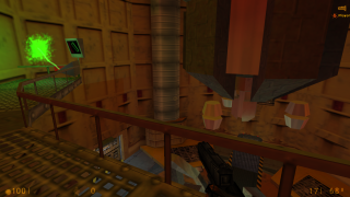
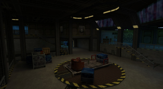
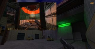
For being an entry in a vanilla contest, Core Critical sure feels unique. The central arena is a huge test chamber, complete with lengthy powerup sequence leading to a map-wide teleportation to Xen for a few minutes in another sprawling arena with limited weaponry. The other areas of the map are also varied and well-built and would feel right at home in BMRF. Overall, Core Critical has a great hook with the teleportation sequence and shuffles things up with the limited weapon selection on Xen - but it's not just a gimmick. This map is an excellent example of an author's vision and technical expertise combining into a very enjoyable and memorable map - and a unanimous choice for first place in this contest.
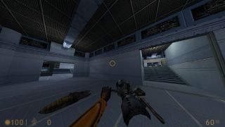
A superb deathmatch map, Cooldown really shines due to its flow between areas and its visually distinct sections. It's also very strong in the vanilla department, feeling like it really could be slotted into BMRF with few changes. There are traps, tempting but risky weapon placements, and a giant mixing vat of blue coolant among the interesting areas. A lot of fun to play with 8 or more players.
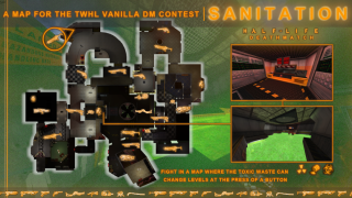
A very cool industrial themed map here. If you can overlook the incessant alarm sounds, this map plays really well - good flow, interesting areas, and a cool central hazard of toxic sludge that rises at times, presenting an increasing threat as it fills level after level. A couple of areas serve as smallish arenas, though it'd be nice if the lowest level of toxic sludge had some more entrance/exit options. Overall a fun map solidly in the vanilla theme.
Other Entries
Surefire feels like a very shrunken version of crossfire, but lacking the polish. It's a hectic small map that is really crazy with more than a couple players. It's more than just a killbox, as there are a handful of structures to fight on and within, but with nearly all weapons available it devolves into chaos. Some careful design and this map could be quite good; as is, it feels like an early draft.
A cool concept for a deathmatch map here, but some different design decisions would have really improved the flow and strengthened this entry. This map combines four distinct themes - some of which are solidly not vanilla Half-Life - Xen, arctic, jungle, and an Office Complex styled section but with several dimensional rifts thrown in for a unique look. One issue is that the connection point for these themed areas, which was a great opportunity for a central arena, just doesn't allow for much action with only a slim outer edge around a crate stack for players to battle. Combine that with some very cramped spots and multiple death pits and the result is a map with a solid idea that lacks in execution and polish.
Complex is a huge, wide open Surface Tension style map with both spacious outdoor and indoor areas. The outside areas are fairly well built, but the indoor sections are pretty empty and seem to be an afterthought in the design. The main drawback in this map is the major dearth of weapons available. If you have a sprawling open map like this, the players need to have immediate access to weapons - or battles just devolve into pistol duels which was unfortunately too common on this map.
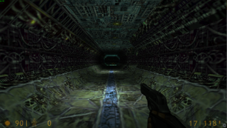
Flashbacks is a clever idea but suffers from some poor choices and execution. It's a set of areas from the Half-Life singleplayer game connected via teleports - such as the test chamber, a hallway from Unforeseen Consequences, and a wide open but dark Xen area. Each area (perhaps except the lengthened tram and the Xen area) is reasonably made, but the choice of areas is poor. A much better idea would be more arena-like spots from the game along with multiple teleports among them.
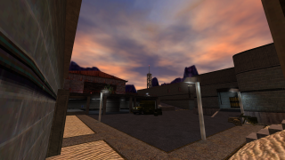
Damnation is a really solid map evoking many of the non-setpiece areas of Surface Tension. The vanilla theming is right on the nose, and the connectivity between the sections is well done - as is weapon placement for the most part. A couple of the areas are more or less dead-end deathtraps, and overall the map could use more arena-style sections. But this is an all-around enjoyable map!
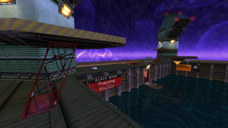
QuadTowers is exactly what it's labeled: a central arena with 4 towers at the corners. It's a nice mix of wide open fighting and cramped corridors connecting the towers along the edges of the map. What unfortunately hampers the action in the central outdoor area is the water. Yes, it eliminates fall damage for the players launched by the jump pads, but it also slows movement for players in the water. Thus often the outer ledge overlooking the arena becomes a superior tactical option. This map is still quite fun and has a nice reward for hitting the 4 tower buttons - a central chamber opens for a short time that holds the egon and ammo for the taking.
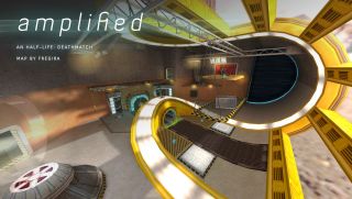
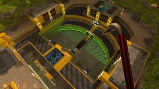
Amplified is a strong entry and overall an exceptional and fun-to-play map. It's centered around two large arenas, one outside and one inside, and a somewhat difficult-to-reach map-wide death trigger (which unfortunately lasts so long that victims die multiple times). But it's the strong geometry, bold colors, and interesting lighting effects that both set this map apart and simultaneously make it not quite fully in the vanilla theme. Nevertheless, one of the coolest maps in the contest.
As the author's first deathmatch map, this has some good aspects and some significant drawbacks as well. While rough in spots, the outdoor arena areas are pretty solid and fun to play in. But the interior of the building and the dark tunnels are not great combat sections, particularly the tight rooms with the slow blocky swinging doors. Overall, a huge map that comes off as overambitious; more focus in the design and planning would likely have yielded a better and smoother-playing map.
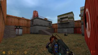
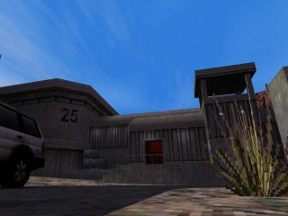
Outer Outpost is a nicely laid out and interconnected map. It has plenty of details and in general a really good vanilla look and feel. However, the flow could be improved. There are a number of dead ends (and 'dead' doors) that can be frustrating, and the upper outdoor area could be opened up a bit more to encourage more combat there as more of an arena centerpiece. But as-is, this map looks great, plays really well, and is a solid entry in this vanilla contest.
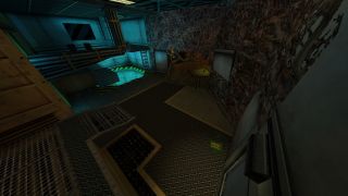
The theming of this map is really cool, mixing some of the industrial and lab styles of Half-Life. One note is that it is quite dark, and looks much better on the old default gamma of 2.5. This is a fairly good-sized map but no arenas to speak of, with several dead end spots, resulting in a map best played with about 8 people max. Better connection among areas and perhaps some more wide-open arena sections would be improvements in our opinion.
Surface Tension is the chosen theme for this map, with a mix of indoor and outdoor sections. Certainly vanilla in theme, but a distinct lack of weapons near most spawns - and the fact that no ammo is offered (only weapons) - result in a somewhat frustrating map, particularly when there are a couple of goodies placed out of reach except by grenade or tau jumping. Unfortunately this feels more like an early version of a map that needs some fixes and polishing.
Ah, a map in the vein of Questionable Ethics. However, blocky design and uninspired lighting combined with several dead ends - and a frustrating crossbow sniping area - relegate this map to decent but frustrating to play. Other than the dead ends, the flow and connectivity are solid. And overall this map can be fun to play. But the easy availability of powerful weapons (and the crossbow area) can condemn you to instant death upon spawn.
Well, we kind of knew there might be some maps submitted that (ab)used the newly available func_vehicles in deathmatch. Here it is. It's not a gimmick map per se, but it clearly needs much more playtesting and polish to get it to a truly playable state. There are a handful of various func_vehicles for added chaos, but even more typical features like a teleporter to Xen is really wonky and hard to use - not to mention the blocky Xen area itself.
A relatively rare fully Xen-themed HLDM map, Escher unfortunately falls somewhat short in actually feeling like Xen. Although the author was going for a tight and claustrophobic version of Xen, the result is too boxy and not very organic. Pulsing lights are overused, and a lot of the map suffers from room-corridor-room design rather than a better flow and interconnection between areas. A decent start for a first deathmatch map, but more careful consideration for flow and overall design would go a long way toward an improved experience.
Here we really just have a small killbox. There hasn't been a ton of effort put in, as the map really is a box with no details or interesting features. That said, it can still be a fun and chaotic time for a couple of minutes. But any killbox-style map still needs design, effort, and testing to be made into a worthwhile map.
Birdlabs is a giant map with a mix of wide open topside areas and tight, winding underground and indoor corridors and rooms. It works visually, especially the huge outside area - but it suffers gameplay-wise due to an absolute dearth of weapons. This map is clearly built with 16+ players in mind, though in our opinion some more balance with weapon/ammo availability would really do wonders. Some playtesters complained about low framerates, so your mileage may vary when it comes to smoothness in this gigantic map.

