Forum posts

Posted 10 years ago2014-08-06 22:49:49 UTC
in Post your screenshots! WIP thread Post #321044
Never mind the script thing, I figured it out.

Added a lot to the Junk Machine last night and today.
  • Scripts to handle picking up and placing props.
  • A more readable and organized equipment table.
  • Lots of price adjustments.
  • Gas cans give you 4 fuel instead of 3.
  • Added some modularity to the junk machine, meaning if it is separated from the fuel system, it is essentially in "Creative mode". Also it helps a bunch when creating new buildable objects.
  • Same old plug and play usability :)
TO DO:
Make the next installment of Let's Build a Rocket. I finally got an idea for it.
Rimrook RimrookSince 2003
Posted 10 years ago2014-08-05 18:42:23 UTC
in Rat Hunt - An awesome demo Post #321016
Tool Assisted Speedrun. I kinda always wanted to try one with HL since it's easily script-able and has a ton of stuff built in for doing it.
Rimrook RimrookSince 2003
Posted 10 years ago2014-08-05 17:22:19 UTC
in Rat Hunt - An awesome demo Post #321009
Yeah the video you made does the level really fast, faster than my attempts.

One of these days I'm going to make a TAS run of it just for shits and giggles.
Rimrook RimrookSince 2003
Posted 10 years ago2014-08-05 16:00:58 UTC
in Post your screenshots! WIP thread Post #321006
oh well.

Still, anyone savvy in using VScripts in source?
Rimrook RimrookSince 2003
Posted 10 years ago2014-08-05 14:25:11 UTC
in Post your screenshots! WIP thread Post #321001
khed does source stuff pretty simply, right?

I'm thinking about revisiting Let's Build a Rocket 2 and making something a little more impressive.

Also, does anyone know how to use VScripts?
Rimrook RimrookSince 2003
Posted 10 years ago2014-08-05 01:19:55 UTC
in Mini Competition 2 - Colors! Post #320994
2 things:

1: I would love to see this reach an amazing number of games and engines.

2: Our prizes are not worth that much TBH. My Art prize has an ambiguous value and I don't know the worth of a Minecraft code.

For now, set it up as a non-official compo for Source/Goldsource.
Rimrook RimrookSince 2003
Posted 10 years ago2014-08-04 15:21:19 UTC
in Mini Competition 2 - Colors! Post #320989
Would this be considered a mini competition or a regular one over at GB?

Also, a lot of the stuff is verbatim, except some of the bullet point stuff and text colors. That's GB specific.

EDIT: TWHL'ers have had a head start. Maybe we should wait and have GB hold a seperate compo only to be fair. Also, our prizes aren't much and maybe when they host their own, they can have their own prize pool for their community. I wouldn't mind sharing the compo idea, put it out there.
Rimrook RimrookSince 2003
Posted 10 years ago2014-08-04 00:40:57 UTC
in Mini Competition 2 - Colors! Post #320981
Does anything need to change from the original brief here or is there a format to follow?
Rimrook RimrookSince 2003
Posted 10 years ago2014-08-03 21:32:15 UTC
in Mini Competition 2 - Colors! Post #320978
I'm OK with it. :)
Rimrook RimrookSince 2003
Posted 10 years ago2014-08-03 14:04:52 UTC
in Mini Competition 2 - Colors! Post #320969
It'd be fun to see what people all over the net would do for goldsource, or source now that we have the materials made for that.

Also I updated the materials so the renaming thing isn't necessary. Kind of a derpy thing to have to do that. OP needs updating too when someone can.

New Link
Rimrook RimrookSince 2003
Posted 10 years ago2014-08-03 13:25:25 UTC
in Sledge (Hammer Alternative) Alpha Build Post #320967
I opened my rats map in the sledge that I have, the previous to the current version, and it chugs a little in the 3D view like it incapable of keeping up. The framerate staggers from quick to slow in a weird way. I think I'll release the source file to the rats map today and that can be checked out. Hope it's just me. :/
Rimrook RimrookSince 2003
Posted 10 years ago2014-08-03 02:32:11 UTC
in Mini Competition 2 - Colors! Post #320961
Mini in the sense that not all aspects of mapping is judged and you can 1 month instead of 2. You also only have to worry about how your map looks, hell you don't even light it :>
Rimrook RimrookSince 2003
Posted 10 years ago2014-08-03 02:28:40 UTC
in Atom's TWHL Minecraft Server Post #320960
When my new farm is up to scratch, I'll connect it to the portal network and I'll throw a party or something.
Rimrook RimrookSince 2003
Posted 10 years ago2014-08-02 22:24:52 UTC
in Mini Competition 2 - Colors! Post #320957
and THAT'S why I gave people a month to work before judging. :/
Rimrook RimrookSince 2003
Posted 10 years ago2014-08-02 01:31:49 UTC
in Mini Competition 2 - Colors! Post #320944
You guys must be busy, nothing new for a bit.
Rimrook RimrookSince 2003
Posted 10 years ago2014-07-31 20:54:07 UTC
in Sketches / Drawings Thread Post #320916
Pro Tip

My eyes see brown as the most comfortable color to look at. I color my background a nice soft 60% brown then draw on top of that. Experiment to see what colors are pleasant to look at and use that. If you use white and draw with black, you can hurt your eyes.

Colors between 40% and 60% brightness range work best, but everyone is individual.

I draw upwards of 8-10 hours a every day and have been for many years. Trust me on this one.
Rimrook RimrookSince 2003
Posted 10 years ago2014-07-31 15:49:35 UTC
in Sledge (Hammer Alternative) Alpha Build Post #320911
As soon as I take down my protection-

BAM!!!

herpes.
Rimrook RimrookSince 2003
Posted 10 years ago2014-07-31 15:41:40 UTC
in Sledge (Hammer Alternative) Alpha Build Post #320909
User posted image Not sure if homo or straight...
Rimrook RimrookSince 2003
Posted 10 years ago2014-07-31 01:34:43 UTC
in Top 5s Post #320899
That's a hard list to make with the bottom 5. There's things I hate ABOUT games but meh, here goes.

5: Kingdom Hearts 2
4: Kingdom Hearts 3
3: Final Fantasy X
2: Final Fantasy X2
1: Kingdom Hearts

Those are games, for me, where it is shorter to list some things I like about them than to list the things I hate.

Both FFX and KH had a few good game mechanics, but the story and gameplay overall were just grating on my nerves. Especially KH where the whole game made me feel like I was too old to play it, which is an awful feeling because I actually enjoy some stupid-assed games. FFX was just mind numbingly bad with its voice acting and the FFX felt pushy. I actually felt perturbed when a cutscene of story came in because all I wanted to do was everything else. X2 was... I don't even.
Rimrook RimrookSince 2003
Posted 10 years ago2014-07-30 23:33:02 UTC
in Post Your Photos Post #320891
Cool pics.

Post 47/50
Rimrook RimrookSince 2003
Posted 10 years ago2014-07-30 19:44:15 UTC
in Sledge (Hammer Alternative) Alpha Build Post #320888
Ewwww I'm not letting my computer play in the yard with your computers.

You're like one of those anti-vaccine parents.
Rimrook RimrookSince 2003
Posted 10 years ago2014-07-30 01:28:16 UTC
in Mini Competition 2 - Colors! Post #320880
Solved the source fullbright problem.

The materials need to be converted to a UnlitGeneric shader type so they don't cast nor receive lighting.

Get the updated materials here.
Rimrook RimrookSince 2003
Posted 10 years ago2014-07-29 14:00:01 UTC
in Mini Competition 2 - Colors! Post #320872
This compo might be difficult break ice with. A good theme goes a LOOOONG way because it defines nearly everything. Whether it be sci-fi or modern, try mapping something you know. Re-imagine Zeeba_Pool, Gauss_God, or DE_Dust_Thunder in a color scheme that is outside your usual or the predictable.

This is a fun tool I found. https://kuler.adobe.com/create/color-wheel/

Also if you want to create something non-themed and unique, you can try different Archetecture (they forgot to list Rococo) or my personal favorite, base the archetecture on the designs seen in furniture.
Rimrook RimrookSince 2003
Posted 10 years ago2014-07-29 00:43:55 UTC
in Sledge (Hammer Alternative) Alpha Build Post #320864
I seriously doubt it has a virus unless you or someone put one in sledge. Maybe this is a part of valve's master plot to maintain a monopoly.
Rimrook RimrookSince 2003
Posted 10 years ago2014-07-28 21:53:22 UTC
in Sledge (Hammer Alternative) Alpha Build Post #320859
Avast is blocking the download for me. lol now you know you're doing something right.
Rimrook RimrookSince 2003
Posted 10 years ago2014-07-27 21:07:19 UTC
in Mini Competition 2 - Colors! Post #320853
Dimbark told me he was converting the textures and CT just stole his thunder.
Rimrook RimrookSince 2003
Posted 10 years ago2014-07-27 16:05:55 UTC
in Mini Competition 2 - Colors! Post #320850
I saw choosing the next compo as being a kind of prize, but we have some real prizes on the table now. Before it was mentioned, I thought the baton would be passed back to Atom.
Rimrook RimrookSince 2003
Posted 10 years ago2014-07-27 02:37:31 UTC
in Sledge (Hammer Alternative) Alpha Build Post #320838
I will try and run some testing on that when I get a moment to do so. Perhaps if something is figured out, I can actually use OBJ geometry for some stuff.
Rimrook RimrookSince 2003
Posted 10 years ago2014-07-27 02:07:07 UTC
in Mini Competition 2 - Colors! Post #320836
TJB, aside from kachito's screenshot, your's is pretty dark. The fake lighting you accomplished is really pretty, don't let anything discourage you, you still have 3 more weeks.

EDIT: Completely forgot about winner chooses next compo idea. I didn't win then previous compo, I only collaborated with the winner (lol).

That rule summary is pretty conclusive. There's a small thing I want to add but it will be announced on August 6th. If you ever watched the monster makeup show "Face Off" or Jim Henson's Creature Shop Challenge, you have a good clue what it might be.
Rimrook RimrookSince 2003
Posted 10 years ago2014-07-26 19:54:36 UTC
in Sledge (Hammer Alternative) Alpha Build Post #320830
I've been having so much trouble with the MAP format. It swiss-cheese a lot of the OBJ stuff I've imported. Since my batch compiler uses MAP format for compile, I have little luck with it.
Rimrook RimrookSince 2003
Posted 10 years ago2014-07-26 16:29:33 UTC
in Mini Competition 2 - Colors! Post #320827
It's not, it looks like a screenshot from some game, hence the icons above some of the buildings.
Rimrook RimrookSince 2003
Posted 10 years ago2014-07-26 14:54:35 UTC
in Mini Competition 2 - Colors! Post #320824
A single well crafted room could win the competition. There's no telling what'll happen.

@Victor_Paiva
Perhaps you should reconsider your color palette. Look at how many shades of green or the colors of the buildings in this picture from the Simpsons.
User posted image
You cannot be afraid to use colors you don't normally see.
Rimrook RimrookSince 2003
Posted 10 years ago2014-07-26 02:23:55 UTC
in Atom's TWHL Minecraft Server Post #320810
My official flag.
User posted image
:cool: nyep.

Gonna edit the wikipage to show that letters are possible.

I like the startgate. That should be our symbol for nether portals.
Rimrook RimrookSince 2003
Posted 10 years ago2014-07-25 22:55:11 UTC
in Atom's TWHL Minecraft Server Post #320802
If I just posted a screenshot, it wouldn't have been funny.

You've been flowered m'friend.
Rimrook RimrookSince 2003
Posted 10 years ago2014-07-25 20:44:11 UTC
in Atom's TWHL Minecraft Server Post #320788
My flag goes like this

Light blue banner base
Center Stripe - Lime
Horizontal Half - Light Blue
Gradient - Blue
Flower - White
Circle - Yellow
Bottom Saw - Lime

BOW DOWN TO OUR SUPERIOR COLORS! We also have bunnies.
Rimrook RimrookSince 2003
Posted 10 years ago2014-07-25 20:34:40 UTC
in Sledge (Hammer Alternative) Alpha Build Post #320786
Comic sans blinking scrolling letters and flashy colours all over the place...
So basically if you used Sledge to enter the colors compo, mysterious things will afflict children?
Rimrook RimrookSince 2003
Posted 10 years ago2014-07-25 20:26:56 UTC
in Mini Competition 2 - Colors! Post #320785
But atom is also judging. :<
Rimrook RimrookSince 2003
Posted 10 years ago2014-07-25 13:07:48 UTC
in Mini Competition 2 - Colors! Post #320775
You have no idea how tough of a judge I can be. I will disqualify someone if they break the rules in any way.
Judging will be based on your clever use of design, color choices, theme, and mood. All other aspects should be used to enhance either of these four elements.
I am judging with my sound off in god mode and noclip, just to eliminate the possibility of being biased by elements I said I wasn't going to judge. That's also why I am defining every rule or even question that comes up. Because it would suck if someone won or didn't based on some technicality.

I'm not the only judge, there's Atom too, but we're both looking at all of them.
Rimrook RimrookSince 2003
Posted 10 years ago2014-07-25 01:28:46 UTC
in Mini Competition 2 - Colors! Post #320766
Not even a week and you guys are really bending the rules.

Gradients = Allowed.
Render Color = Allowed.
Sprites = Allowed.

Source = Allowed. On the grounds of little difference anyway
Someone needs to port the materials. I'm not available to do so for a while.

Multiple entries = allowed. If you can pack them together, that's makes managing the downloads a tad easier.

The deadline HAS NOT YET CHANGED fyi.

Nyan = Banned.
Rimrook RimrookSince 2003
Posted 10 years ago2014-07-25 01:19:10 UTC
in Sledge (Hammer Alternative) Alpha Build Post #320765
Yeah that is really cool :D

Albeit really gimmicky but at least he's honest about it.

I still wish you would put the OBJ thing as a tool with better options than an import from the file menu. >:[
Rimrook RimrookSince 2003
Posted 10 years ago2014-07-24 11:29:17 UTC
in Mini Competition 2 - Colors! Post #320719
Been just over 2 days and there are quite a few progress shots. You guys are doing great!
Rimrook RimrookSince 2003
Posted 10 years ago2014-07-24 03:55:17 UTC
in Atom's TWHL Minecraft Server Post #320708
A server reset may be in order after this next update. A lot of good new world generation stuff.
Rimrook RimrookSince 2003
Posted 10 years ago2014-07-24 00:44:43 UTC
in Mini Competition 2 - Colors! Post #320706
That's m'boy!
Rimrook RimrookSince 2003
Posted 10 years ago2014-07-24 00:11:38 UTC
in Atom's TWHL Minecraft Server Post #320703
We have to make a color grounds where we each display our banners.

Capture the flag stuff would certainly be interesting, though if a banner is at all in your inventory, it should display on your character. Its way too easy to hide it otherwise.
Rimrook RimrookSince 2003
Posted 10 years ago2014-07-23 23:58:49 UTC
in Mini Competition 2 - Colors! Post #320702
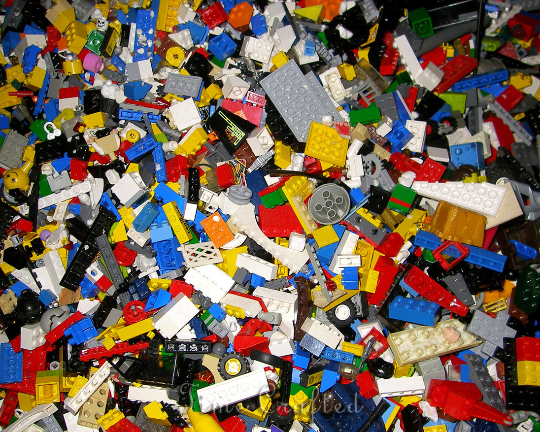
I'll chip in with a lego themed map
As long as it doesn't look like this.
User posted image
Besides, how can you do lego with the colors wad? It would just look like a bunch of colored bricks with no other definition besides its color, which would resemble but not look at all like lego.
Rimrook RimrookSince 2003
Posted 10 years ago2014-07-23 21:16:22 UTC
in Mini Competition 2 - Colors! Post #320693
Even though we have some incredibly nice RAD tools now, maps always tend to be dark. I see now why they added color correction and HDR. Though with how bright and brilliant the screenshots are, it doesn't even LOOK like goldsource. That's the kind of shit I want to see.

If anyone wants to enter this compo and is having trouble coming up with something, ask for help. I want to as many people as possible try this. Even if you don't enter, I still want you to experiment with something out of the box.

Where's Dimbark, he needs to enter. Though he asked about porting this to source/HL2.

If there is a demand for Source, I'll allow it. Just say so if you want source involved. Please note I do not have Ep2, only HL2.
Rimrook RimrookSince 2003
Posted 10 years ago2014-07-23 20:20:05 UTC
in Mini Competition 2 - Colors! Post #320690
I just noticed Brendanmint already made the building in the lower left part of that picture. Could just play around with silhouettes and the power of suggestion to form the rest of the city. Could have a winner with that one.
Rimrook RimrookSince 2003
Posted 10 years ago2014-07-23 18:56:27 UTC
in Atom's TWHL Minecraft Server Post #320683
TWHL MC 1.9 - "WE ARE THE KNIGHTS THAT SAY NIH!"
Rimrook RimrookSince 2003
Posted 10 years ago2014-07-23 18:40:48 UTC
in Atom's TWHL Minecraft Server Post #320681
I think my flag was like blue, green, and white or something like that back on the old TWHL planet map.
Rimrook RimrookSince 2003
Posted 10 years ago2014-07-23 13:15:23 UTC
in Mini Competition 2 - Colors! Post #320667
Brendanmint you don't suck. That building and that stop light are actually really well crafted. Lots to do in a city, ya know?
User posted image
Rimrook RimrookSince 2003