As you can guess by the title, this is a thread by me about my maps.
In the past Easter holidays, I made a HLDM and a HL map. However, the maps I've posted about in the forums are all for the Source engine.
Since these maps require harder work, I'd like to establish some sort of order or priority based on what the community finds more interesting.
I know what map the CS:Source community wants, and probably what Freshed will say if he sees this thread.
In order of when I started each:
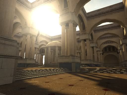
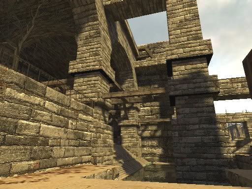
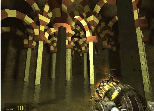
Carceri: this HL2 singleplayer map looks great, but I can't find a way to include good gameplay in it. Some parts are just too big.
Tinnos:Source: this HL2DM proyect is sort of blocked. As many people observed, it just feels like HL, only a bit prettier. My bump map experiments began here.
cs_fallingwater: the cs:s version of Kaufmann House. It requires a lot of rework in the outside area in order to be playable. Tough one.
dm_sacrifice: There's very little actual mapping of this HL2DM project, but a lot of ideas and concepts have been decided. It could be a very original map. It would also need a lot of new materials.
Kasperg Projects!
Created 18 years ago2006-04-25 18:24:30 UTC by
 Kasperg
Created 18 years ago2006-04-25 18:24:30 UTC by
![]() Kasperg
Kasperg
Posted 18 years ago2006-04-25 18:24:30 UTC
Post #176713
Posted 18 years ago2006-04-25 18:28:03 UTC
Post #176715
I sense arrogance and a huge ego.
Posted 18 years ago2006-04-25 18:30:19 UTC
Post #176716
You sense wrong young padawan  Thanks for your feedback!
It seems everyone can post in this forum section except me, because I have more unfinished maps?
 Thanks for your feedback!
It seems everyone can post in this forum section except me, because I have more unfinished maps?
Posted 18 years ago2006-04-25 18:31:58 UTC
Post #176717
That wasnt a compliment in case you were wondering.
Posted 18 years ago2006-04-25 18:33:27 UTC
Post #176718
I personally like the first, second, and last.
Posted 18 years ago2006-04-25 18:37:48 UTC
Post #176720
By second, do you mean the second screenshot or the second map?
Posted 18 years ago2006-04-25 19:09:02 UTC
Post #176723
For the big parts of Carceri, use snipers 'n crossbows 'n shit. It's not like every area has to have combat, anyway, you could start in the really big areas and be like "oh this interesting" and then get into some smaller areas where combat's more suitable.
Posted 18 years ago2006-04-25 19:12:37 UTC
Post #176725
There are some smaller areas with combat, but the problem with the big areas is that it takes too long to get from one place to another. It's out of the question to include any modern means of transportation in the map.
I've never used combine snipers before. Great idea!
I've never used combine snipers before. Great idea!
Posted 18 years ago2006-04-25 19:23:12 UTC
Post #176730
How about blocking off area's in those large area's, like the Combine did in the train station at HL2's start? Or some collapsed parts (though that would probably mean you'd have to create more damaged area's to keep the map consistent).
Obviously, I prefer Carceri. Especially the outside looks nice. The inside looks interesting but at the same time monotone because of the repetetious architecture parts (damaged parts would definitely 'break' it up there) and it's essentially one playable plane. I prefer multi-leveled combat.
As for modern transport being out of the question... a racing part with the sandbuggy through an ancient temple/palace doesn't sound too bad too me...
Obviously, I prefer Carceri. Especially the outside looks nice. The inside looks interesting but at the same time monotone because of the repetetious architecture parts (damaged parts would definitely 'break' it up there) and it's essentially one playable plane. I prefer multi-leveled combat.

As for modern transport being out of the question... a racing part with the sandbuggy through an ancient temple/palace doesn't sound too bad too me...

Posted 18 years ago2006-04-25 19:36:38 UTC
Post #176732
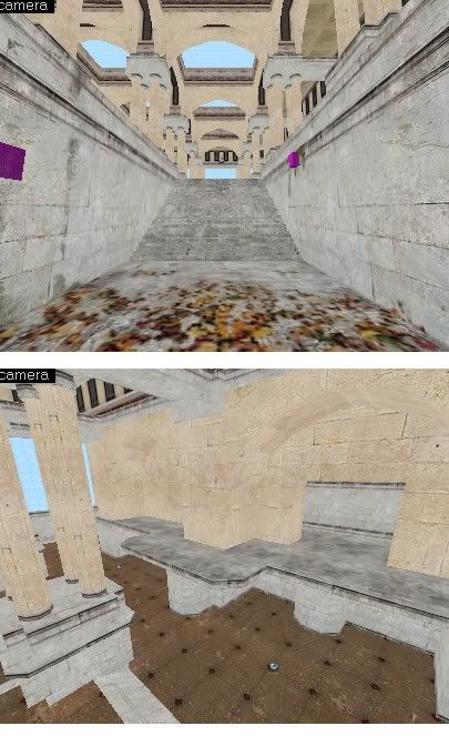
Well, the inside isn't just one plane. In fact, I recently started working with ways to break & make it better. The way you enter this place is also very important.
top:entrance
bottom: elevated walkways in the perimeter.I'm afraid that including Combine walls might destroy the sense of serenity in that particular arena (or at least you are tricked to think the place is quiet)
But I think you might be right about the sandbuggy
top:entrance
bottom: elevated walkways in the perimeter.I'm afraid that including Combine walls might destroy the sense of serenity in that particular arena (or at least you are tricked to think the place is quiet)
But I think you might be right about the sandbuggy

Posted 18 years ago2006-04-25 19:50:41 UTC
Post #176734
Of all the maps above, I am most eagerly awaiting Carceri. cs_fallingwater looks nice too, obviously, but bringing up the framerates may be an impossible feat.
Here are some suggestions for Carceri. From the first screenshot, I think the architecture lends itself nicely to a battle with two gunships (like that first part of Nova Prospekt). Of course, during the aerial battle, annoying combines with pulse rifles keep popping up at different sections of the map too, keeping the player nicely entertained. The dynamic ammo crate for the rocket launcher should be in places where it's risky to be exposed for the gunships' fire. But that just adds to the fun.
And fighting doesn't always involve combine soldiers with guns either. An antlion guard and several regular antlions could be interesting for the second screenshot. It looks like it has a lot of hiding places from the antlion guards, but don't forget to hide plenty of fast headcrabs at those hiding places. Just as the player takes a breather from the antlion guard, spawn those nasty suckers and bite the crap out of him.
That should keep the player on his toes.
[EDIT]: If you want to keep the serenity of the ambiance, turn off the rotor whirl for the gunships. I know there is a flag for that NPC.
Posted 18 years ago2006-04-25 19:53:07 UTC
Post #176735
Funny. There's been an antlion guard in the inside area since the first day of testing 

Posted 18 years ago2006-04-26 11:43:58 UTC
Post #176822
Wow...that first screenshot is amazing. 

Posted 18 years ago2006-04-26 12:04:59 UTC
Post #176830
i like the first screenshot and the second screenshot. the rest look a little less refined.
It seems everyone can post in this forum section except me, because I have more unfinished maps?welcome to my world. i've finished a whopping 13% of my maps.
Posted 18 years ago2006-04-26 12:13:27 UTC
Post #176834
By second, do you mean the second screenshot or the second map?Screenshot.
Posted 18 years ago2006-04-26 12:24:09 UTC
Post #176837
welcome to my world. i've finished a whopping 13% of my maps.That's actually a high finish ratio...
Posted 18 years ago2006-04-26 12:39:32 UTC
Post #176843
Lol, not finishing a map is nothing to be ashamed of. It happens to everyone involved in the creative industries.
Let's say your favourite music artist made a song which they didn't think was any good and so they don't release it.
Same applies here, if you don't like your own piece of work, don't release it or finish it. You have to come up with a good set-up that appeals to YOU.
Let's say your favourite music artist made a song which they didn't think was any good and so they don't release it.
Same applies here, if you don't like your own piece of work, don't release it or finish it. You have to come up with a good set-up that appeals to YOU.
Posted 18 years ago2006-04-26 12:42:06 UTC
Post #176844
Of course, it happens, and there's nothing wrong with it, but a too low ratio isn't really encouraging in the end...
Posted 18 years ago2006-04-26 12:49:08 UTC
Post #176845
let's see some more fallingwater
Posted 18 years ago2006-04-26 13:01:51 UTC
Post #176847
Agreed, that FallingWater house is quite a remarkable feat of enginnering and design. Hopefully you can finish it up in the future. It would make for a great CS:S map! Terrorists starting from within the house and CT's starting from across the little bridge. (You could also put a couple APCs near there too.)
Posted 18 years ago2006-04-26 13:41:55 UTC
Post #176861
As long as your happy with your finishd maps.
Kasperg:
Looks great, looking forward to more!
Kasperg:
Looks great, looking forward to more!
Posted 18 years ago2006-04-26 17:59:10 UTC
Post #176904
The first pic from Carceri looks great. Really nice artitecture. That place fits a huge monster! 
If I were to create a game with that map I'd make you go into underground tunnels/catacombs and when you get out it's night and some ceremony is going on. (you hear chants, maybe you'll even see the place that ceremony takes place) A bright light comes from the midest of the man that participate in the ceremony, you hear screams, and hell breaks loose.
Sorry, I got a bit excited... this is the only idea I could think of and it really fits the tample you built, it fits doom3 better then Hl2 unless you are intending to make new monsters.
Apart from that you can make the same plot like you made in that small map you recently submitted: Combine finds this tample and something in it intrests them... hardly original. :
Posted 18 years ago2006-04-26 18:04:46 UTC
Post #176906
I don't think a night sky and lighting would suit the map. The ceremony idea is nice, but all of that is easier with HL1.
About the plot... I don't think it's absolutely needed. My life doesn't have a plot, for example. Does yours?
Edit: By the way: even if it looks good, it's still far from what I had tried to recreate Maybe with Half-life 3 and a workstation to compile.
About the plot... I don't think it's absolutely needed. My life doesn't have a plot, for example. Does yours?
Edit: By the way: even if it looks good, it's still far from what I had tried to recreate
 Maybe with Half-life 3 and a workstation to compile.
Posted 18 years ago2006-04-26 18:12:30 UTC
Post #176911
Yes but having a plot in a game is always fun.
I don't think Hl2 would have been so much fun if you would just run around in arenas killing people endlessly without any goal.
Think of it even doom1 has a plot. Maybe it's not that important in there but it gives an end to the game, which is good.
If you wont have fights then it will be just a map for people to watch. It is not really fun to walk around and look at good architecture.
Oh shit I said man instead of men in my last post, whoops.
Edit:
I don't think Hl2 would have been so much fun if you would just run around in arenas killing people endlessly without any goal.
Think of it even doom1 has a plot. Maybe it's not that important in there but it gives an end to the game, which is good.
If you wont have fights then it will be just a map for people to watch. It is not really fun to walk around and look at good architecture.
Oh shit I said man instead of men in my last post, whoops.

Edit:
Is that the tample you mapped in hammer? If it is then how can you know if it will look good when you make the map. In hammer 4 it looks so horrible.
Posted 18 years ago2006-04-26 18:15:45 UTC
Post #176915
You really did a good job re-creating that scene in source. That map really looks fun. Can you PM me when its finished? Looks really cool, and well made 

Posted 18 years ago2006-04-26 18:24:45 UTC
Post #176916
how can you know if it will look good when you make the map. In hammer 4 it looks so horrible.You're not going to believe how... Compiling it!!
Actually, every architect has to work that way. How do you know something will look good until it is built? I don't think it looks bad at all in Hammer4. But I do miss the shading and depth of the 3D view of Hammer 3.4 I hope they fix it soon.
And Xyos, you'll know when the map is ready. But I can't guarantee it'll be anytime soon. The biggest problem (besides inspiration and dealing with University after these holidays) is the LONG compile times in this map. Even with cordon bounds and func_details...
Posted 18 years ago2006-05-01 07:37:17 UTC
Post #177641
I have made some progress with adding combat to the big area. I've had to add lots of info_nodes and path track entities to prevent monsters from getting lost, and they seem to navigate the map pretty well.
If any of you remember my outdated PC specs, I have a PIV 2 Ghz and a Geforce4 Ti 4200. Even with that, this huge area has a very acceptable performance >> http://img115.imageshack.us/img115/1481/frames6hc.jpg
It's funny, but I think the absence of prop_statics and other models is what gives me a good performance here. Models aren't always cheaper to render.
A full compile of only that area of the first screenshot takes about 3 hours. I decided to experiment with HL1 skins and came up with a possible theme for a HL1 singleplayer map >> http://img441.imageshack.us/img441/2495/bridge6nc.jpg
Posted 18 years ago2006-05-01 07:39:36 UTC
Post #177642
Star Trek! Very nice skins!
I like the artistic map with the pillars...Something is missing though...It just needs something I can't put my finger on.
I like the artistic map with the pillars...Something is missing though...It just needs something I can't put my finger on.
Posted 18 years ago2006-05-01 08:00:34 UTC
Post #177648
lawl! Star Trek 4 teh w1n
Posted 18 years ago2006-05-21 09:26:17 UTC
Post #181326
Updates!
I have been working on more skins and continued a bit of this HL map. I have an interesting story for this minimod. I will of course try to make it last longer than my other HL singleplayer map.
I have been working on more skins and continued a bit of this HL map. I have an interesting story for this minimod. I will of course try to make it last longer than my other HL singleplayer map.
Posted 18 years ago2006-05-21 10:16:42 UTC
Post #181328
Looks like wrapcore for singleplayer.
Posted 18 years ago2006-05-21 10:45:02 UTC
Post #181329
Yes, I will be using the same (and upgraded) texture set. The brushwork is 100% from scratch, and not everything will happen in the same federation ship.
Posted 18 years ago2006-05-21 10:59:48 UTC
Post #181330
I actually had some difficulty deciding which engine those two were from.
Posted 18 years ago2006-05-21 12:22:39 UTC
Post #181333
Yeah...Kinda looks like Source...Shiny textures almost 
Looking great!

Looking great!
Posted 18 years ago2006-05-21 13:10:50 UTC
Post #181334
As always, your texturing and brushwork are excellent.
>> Personal preference << Use colors from the same side of the color wheel to create a consistent "theme" for texturing. Instead of blues and reds together, use yellows, greens and blues together. If you want to keep the contrasting blues and reds, throw in a little purple (blue+red) to tie the reds and blues together.
>> Personal preference << Use colors from the same side of the color wheel to create a consistent "theme" for texturing. Instead of blues and reds together, use yellows, greens and blues together. If you want to keep the contrasting blues and reds, throw in a little purple (blue+red) to tie the reds and blues together.
Posted 18 years ago2006-05-21 13:13:54 UTC
Post #181335
It looks like star trek :D.
I'm not playing it if the scientists are not wearing spandex though...
I'm not playing it if the scientists are not wearing spandex though...
Posted 18 years ago2006-05-21 13:37:00 UTC
Post #181336
Thanks
@BJ: I'll give it try giving the blue light a slight purple tone. The original Enterprise-E halls have this color theme, I didn't make it up
http://www.stefanogalli.it/oldproxima/gallery_first_contact/first_contact0266.jpg
http://www.stefanogalli.it/oldproxima/gallery_first_contact/first_contact0292.jpg
@BJ: I'll give it try giving the blue light a slight purple tone. The original Enterprise-E halls have this color theme, I didn't make it up

http://www.stefanogalli.it/oldproxima/gallery_first_contact/first_contact0266.jpg
http://www.stefanogalli.it/oldproxima/gallery_first_contact/first_contact0292.jpg
Posted 18 years ago2006-05-21 15:07:22 UTC
Post #181338
I like the pix! It may be the old tradition of painting the floors of battleships red to hide the blood. 

Posted 18 years ago2006-05-22 04:58:31 UTC
Post #181432
Same image as one I posted before but with changes. If some of you have played my startrek maps, the brown texture is almost everywhere. I created another texture for the different rooms, leaving the brown texture for the halls.
Posted 18 years ago2006-05-22 13:55:21 UTC
Post #181484
Perfect. Nothing more, nothing less.
Posted 18 years ago2006-05-22 14:10:56 UTC
Post #181489
To any mapper that wants to keep improving, I'd like to say that this star trek map is the result of 4 years of progress. I took screenshots of all three Enterprise bridges so you can compare. Things are rarely good the first time you try.
2002 - cs_1701ev2
2004 - Warpcore
2006 - unnamed project
2002 - cs_1701ev2
2004 - Warpcore
2006 - unnamed project
Posted 18 years ago2006-05-22 14:26:19 UTC
Post #181490
They are all quite the same. It looks like you built wrapcore on base of the first one... only with diffrent detail and textures. Whats with the AAAtexture in wrapcore's screeni?
Posted 18 years ago2006-05-22 14:36:21 UTC
Post #181491
I think that particular computer panel was a func_wall. Since I was slightly out of the map area when I took the screenshot, entities became invisible.
All three bridges were done from scratch. As a matter of fact, I have an even older design for the bridge (besides the Voyager one, that is)
All three bridges were done from scratch. As a matter of fact, I have an even older design for the bridge (besides the Voyager one, that is)
Posted 18 years ago2006-05-22 14:41:18 UTC
Post #181493
Dude, they do not look "quite similar" :P.
Posted 18 years ago2006-05-22 14:52:27 UTC
Post #181496
GAH! STOP CALLING IT WRAPCORE!!!
Anyways, pwnage Kasperg - as usual
Anyways, pwnage Kasperg - as usual
Posted 18 years ago2006-05-23 11:11:12 UTC
Post #181644
Hunter, you have incured my abhorrence.
Posted 18 years ago2006-05-23 12:00:21 UTC
Post #181647
Hunter, you have incured my abhorrence.Whaaat?
Posted 18 years ago2006-05-24 05:20:47 UTC
Post #181755
Google it  Muzzle...
Anyway what you working on now Kasperg besides that 'Star Trek' map.
 Muzzle...
Anyway what you working on now Kasperg besides that 'Star Trek' map.
Posted 18 years ago2006-05-24 07:46:46 UTC
Post #181765
Posted 18 years ago2006-05-24 09:54:47 UTC
Post #181780
Thanks.
I get more than enough daily feedback and criticism from my teachers when doing my real architectural projects at University. I don't need more of the same with mapping since it's a hobby.
I don't want to become a Gustavo or Scary_jeff (I don't like their themes at all, even if they are well crafted). It is not my objective.
What I want is to have fun while mapping. When I'm not enjoying a map, I tend to finish it. I am not a masochist who spends one year making a map just so other people think I'm 133t or something. I don't get paid, so I'm my own boss. By the way, there is not a single map out there that can be considered complete. But you already knew that, I bet.
Different people have different motivations. Welcome to the real World
About what I said in my comments in "Serene", I was just pointing out that you believe any map needs your (or other mapper's) advice to become better maps. I don't think that's always the case. Would you give me any tips on how to make my Tokyo Museum better? Maybe you could but since you are probably not entirely familiar with Le Corbusier's work, your opinion would be worthless :
@Habboi: I left "Carceri" aside again, and I'm finishing up "cs_fallingwater" The problem is I run out of memory while doing a full compile

I get more than enough daily feedback and criticism from my teachers when doing my real architectural projects at University. I don't need more of the same with mapping since it's a hobby.
I don't want to become a Gustavo or Scary_jeff (I don't like their themes at all, even if they are well crafted). It is not my objective.
What I want is to have fun while mapping. When I'm not enjoying a map, I tend to finish it. I am not a masochist who spends one year making a map just so other people think I'm 133t or something. I don't get paid, so I'm my own boss. By the way, there is not a single map out there that can be considered complete. But you already knew that, I bet.
Different people have different motivations. Welcome to the real World

About what I said in my comments in "Serene", I was just pointing out that you believe any map needs your (or other mapper's) advice to become better maps. I don't think that's always the case. Would you give me any tips on how to make my Tokyo Museum better? Maybe you could but since you are probably not entirely familiar with Le Corbusier's work, your opinion would be worthless :
@Habboi: I left "Carceri" aside again, and I'm finishing up "cs_fallingwater" The problem is I run out of memory while doing a full compile

You must be logged in to post a response.

