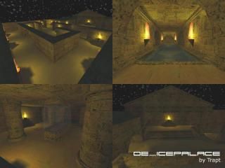
de_icepalace
de_icepalace - Bomb Defuse
Hey!!! This is a night map and it IS meant to be dark, so dont complain about it. Please comment, good and bad comments are welcome, and tell me what i need to improve on.
-Trapt
Hey!!! This is a night map and it IS meant to be dark, so dont complain about it. Please comment, good and bad comments are welcome, and tell me what i need to improve on.
-Trapt
6 Comments
You must log in to post a comment. You can login or register a new account.

 CS
CS


Other then that I think it looks fine, it seems to me though that it repeats... maybe its the textures or all those torches... hehe. I like the idea, but maybe add a few differences... also I never really liked the bomb site under water... but that is just me... I give it a **
Still I will complain about it. Dark maps just aren't popular. Players dislike to be killed by someone they couldn't see. It's a given fact. But OK, go ahead if you want to make dark maps. Don't suspect them to be popular though...
Besides than, I liked:
1. The setting, a temple by night.
2. The moon (or star?) above the temple. Nice little touch.
I didn't like:
1. The extremely high r_speeds. 5000 is way too much. Do some research on r_speeds before you make another map.
2. The somewhat maze-alike layout. You need to focus more on layout IMO.
3. The look. It didn't look nice. Combination of almost total darkness on most faces, and repeating yellow light. Some more variation in lighting, texturing and architecture would be good.
After all, I feel you haven't become really better since cs_aztec. I liked that map much more.