compact

Half-Life: Deathmatch HLDM
compact by antamancer
Posted 20 years ago2004-05-27 20:55:54 UTC • Completed • Half-Life: Deathmatch
Loading...
Screenshot Thumbnail
Name
compact
By
antamancer antamancer
Type
Map
Engine
Goldsource
Game
Half-Life: Deathmatch
Category
Completed
Included
BSP
Created
20 years ago2004-05-27 20:55:54 UTC
Updated
15 years ago2009-01-14 17:03:59 UTC
Views
3476
Downloads
786
Comments
10
Download

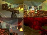
This is a great map. If fast paced killfests are your thing, then this map is for you. But still no matter what, you should try this map. One of the cool things about it is the mounted weapons. One side has a rocket launcher and a machine gun, and the other a laser and flame-thrower.

10 Comments

Commented 20 years ago2004-05-28 01:09:26 UTC Comment #2098
I found it less great than you thought it was. If it's for the flamethrower idea, I like it. The rest of the map wasn't that interesting.

Pros:
1. Flamethrower.
2. Rapid rocketlauncher (let the mayhem start!).

Cons:
1. Little mayhem to start. Fast paced? No. Only once in a while a houndeye popped up to die by the guns.
2. The map is kindof purposeless. I checked out the flamethrower and that's pretty much all reason I played this thing.
3. Too simple architecture, although some nice details now and then, overall it's way too simple.
4. Bad lighting. Looks ugly, in some places it's light but I can't see lamps or light sources (water area).
5. Bad water. Make it's max. wave height way lower, this looks very ugly.

A tip: don't enclose your map with a box. Only makes compile times longer because all the extra space and faces that have to be compiled.

Another tip: I'd suggest you should read some articles about design, what makes a map good. I wish you a lot of succes with further maps!
Commented 20 years ago2004-05-28 03:26:37 UTC Comment #2099
Goodmap
Commented 20 years ago2004-05-28 06:16:20 UTC Comment #2100
Try pushing the button in the tunnel while someones obove ground(but push it again afterwards). And also I will try to fix all the cons about it and update this map.
Commented 20 years ago2004-05-28 10:40:15 UTC Comment #2101
Give the level a bit more sense of space too. I mean, let it represent an area with a purpose, not just a generic level. And it might be nice for the player to be able to achieve something, e.g. give him some challenge. Killing houdeye's might be fun but it's not challenging with the weaponry I had at my disposal. Gradually expose the player to more though enemy's and give him a reward when he's done a hard job, like letting the player find a new weapon or let him see a particular beautiful part of the level, just something that satisfies a player. Like he has earned it.
Commented 20 years ago2004-05-28 15:15:26 UTC Comment #2103
this is supposed to be a deathmatch arena not a single player level. I agree that I should add some detail, fix lighting and change where you get weapons and I will. I will fix any bugs you find as well.
Commented 20 years ago2004-05-29 03:04:16 UTC Comment #2106
wow, your rating is screwed. but il chek it out later, little to early for me now:P
Commented 20 years ago2004-05-29 04:08:29 UTC Comment #2107
Hhm, so it's supposed to be a DM-map? Pretty bad connectivity, very small feeling to it. Probably hard to navigate in it, too small overall. Have a look at popular DM levels and figure out what made them good, then play around with those factors.
Commented 20 years ago2004-05-29 14:09:22 UTC Comment #2117
Humm you know what you should have? Some sort of counter thing and then when you kill, say 10 (w/e), you get moved to a completely new arena!
Commented 20 years ago2004-06-01 06:06:34 UTC Comment #2175
i have too agree it kinda cruddy but then again it wierd

EDIT: Wow, I sucked at typing way back when... >_>
Commented 15 years ago2009-01-14 13:51:14 UTC Comment #17153
You still suck, Strideh. ;)

You must log in to post a comment. You can login or register a new account.