Amateur Textures
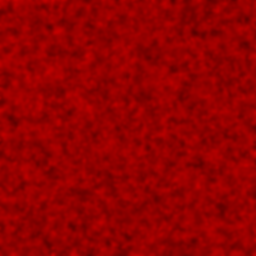
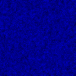
Okay guys... the wad file included in the zip is my first ever test of custom textures.
Rate this please? And please remember I'm new at texturing for half-life.
PS- if you use my wad in a map, please give me credit!
Rate this please? And please remember I'm new at texturing for half-life.
PS- if you use my wad in a map, please give me credit!

2 Comments
You must log in to post a comment. You can login or register a new account.

 HL
HL

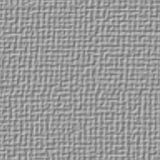

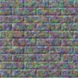
Well, a nice first try but obvious a lot to improve on. Just like me.
1. None of the textures is totally seamless, you can see the tiling effect by the non-seaming edges.
2. The textures don't really look like the material they have to represent. Look at the real world, photographs and try to imitate that. It helps for me...
3. The wall has very ugly blurring colors. Really wastes it.
After all, these are your first ones and not fitted for real use. But you're doing it and I'm sure you'll improve and get the hang of it. I can see shape, contour and depth in your textures already and that's good. Continue, Esmajor, and you'll get good after a while.