Abandoned

Half-Life HL
Abandoned by Trapt
Posted 20 years ago2004-07-19 07:35:53 UTC • Completed • Half-Life
Loading...
Screenshot Thumbnail
Name
Abandoned
By
Trapt Trapt
Type
Map
Engine
Goldsource
Game
Half-Life
Category
Completed
Included
BSP
Created
20 years ago2004-07-19 07:35:53 UTC
Updated
20 years ago2004-09-29 05:01:11 UTC
Views
3165
Downloads
893
Comments
11
Download

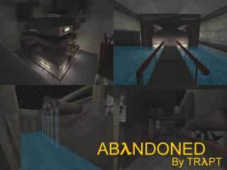
My Build A Machine compo entry. I got some positive feedback from people on my site, so I decided to post it here. No gameplay, just a map where you walk around and look at an old, abandoned machine. It's a bit dark but oh well. Please comment and visit my new site, www.traptsmapping.tk :)

11 Comments

Commented 20 years ago2004-07-19 10:59:21 UTC Comment #2783
Its pretty good. really dark in places and its really easy to get lost in. the machine itself looks good but really doen't seem to have a purpose. and the R_speeds are high. other then that it was good. probably will get better then mine.
Commented 20 years ago2004-07-19 15:23:58 UTC Comment #2788
+Good use of textures.
+Nice architecture.
+Cool broken glass.
+-Good machine, but as gargantua said, it has no purpose.
-Too dark.

I give it a 4/5.
Commented 20 years ago2004-07-19 19:02:25 UTC Comment #2791
Why do all people upload their compo entries?
They are available when the results are out.
Anyway the screenshot looks auspicious, I'm downloading it right now.
Commented 20 years ago2004-07-20 08:22:06 UTC Comment #2800
Good screenshot photography, I must admit
Commented 20 years ago2004-07-21 02:41:38 UTC Comment #2808
What I would like to know is, why is this only 2 stars. That means its worse than a whole shitload of crappy maps on this site. I mean rooooms has 3 stars, and all that is is a badly textured hollow box with a hostage....

I don't want to sound stuck up or anything, but I put a lot of effort into this map, and I really think it deserves more than two stars. And the fact that it has been rated 9 times with only 4 comments is just annoying. This site needs to be like Snarkpit, where you can only rate if you comment in my opinion.
Commented 20 years ago2004-07-22 01:17:32 UTC Comment #2824
trapt that was a touching speech, i dont play hl so im not gonna play it but it looks good... u put alot of work into as u said so 5 stars!!!
Commented 20 years ago2004-07-26 06:29:38 UTC Comment #2891
Yes, this is worth more than just 3 stars. Again, I think we have a too rough rating system. 5 stars would be a bit too high but 4 would be too low. Well, anyway, concerning the goal of this map off course.

Looks good, the machine looks indeed as if it belongs there and has a purpose, probably some tin-can packaging or such. The athmosphere could've been a bit stronger with some more sounds, and those spark sounds get a bit annoying. However, the map looks decent, I like how you used the space, it's all pretty close on each other and nicely connected. The darnkness in the map however makes the detail hard to see, so a bit more (subtle) lighting would've done your map much good.

Heh, and I like that comment in your readme... Thanks! :)
Commented 20 years ago2004-07-26 07:31:30 UTC Comment #2896
+ Generally great!
- So so dark.
Commented 20 years ago2004-08-06 19:37:36 UTC Comment #3197
i like your map in my opinion and i really like the lighting even though its kinda dark
Commented 20 years ago2004-08-18 12:28:15 UTC Comment #3416
hey trapt ur working on our Hl2 mod team. u know the,
*t@[JEDI]@t* one.
Commented 20 years ago2004-09-22 07:52:09 UTC Comment #4022
a bit dark aye! :/
But its a great map, but the elevator/lift is teh UGLI! :)

You must log in to post a comment. You can login or register a new account.