center
 HLDM
HLDM
center
by
rend0us
Posted 20 years ago2004-08-24 02:11:38 UTC •
Completed •
Half-Life: Deathmatch
- Name
- center
- By
-
 rend0us
 - Type
- Map
- Engine
- Goldsource
- Game
- Half-Life: Deathmatch
- Category
- Completed
- Included
- BSP
- Created
- 20 years ago2004-08-24 02:11:38 UTC
- Updated
- 18 years ago2006-07-28 23:17:34 UTC
- Views
- 1680
- Downloads
- 890
- Comments
- 5
- Rating
- 4.00 (1)
- Reviews
- 0
oldie map .. UPDATED LINK
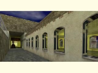
center map took a few sittings there are some visability issues. "not perfect" maps more based as eye candy or for fun game play. comments would be cool too allways room for that. tks all, i love this site:)
center map took a few sittings there are some visability issues. "not perfect" maps more based as eye candy or for fun game play. comments would be cool too allways room for that. tks all, i love this site:)
5 Comments
You must log in to post a comment. You can login or register a new account.


good texturing.
Nice windows.
4/5