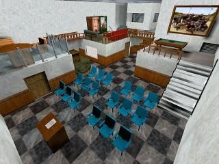
cs_lounge
- Name
- cs_lounge
- By
-
 The Creeper
 - Type
- Map
- Engine
- Goldsource
- Game
- Counter-Strike
- Category
- Completed
- Included
- BSP
- Created
- 21 years ago2003-10-05 15:58:28 UTC
- Updated
- 21 years ago2003-12-14 12:20:10 UTC
- Views
- 2058
- Downloads
- 1158
- Comments
- 7
- Reviews
- 0
You find yourself in an large office building's
lounge, where all the employees come
for breaks. But you're not here for a cup of
coffee...
Counter-Terrorists: Dispose of terrorists, or enjoy
a nice cup of coffee if you like.
Terrorists: Same old story, kill CT's
Let me know if you find any bugs:
schaaf@absamail.co.za
Don't let me know if it lags, because you
can't tell me anything about lag...
I only get 7 frames a second on this map!
7 Comments
You must log in to post a comment. You can login or register a new account.

 CS
CS


Take a glance at this screenshot:
http://www.snarkpit.com/pits/orpheus/comp_reviews/broken_palace/1.jpg
There is far less detail but through use of the detail and blending using lighting and ambience, the author has made the map look and feel a lot better.
One of my screenshots:
http://www.hammre.co.uk/screens/ns_roughneck5.jpg
Again, a lot less deail is used but the detail which is used is blended and enhanced using lighting and fine texturing. R-speeds in this area are about 400, making an educated guess, I'd say that your screenshot will have in excess of 5000. Software users will start dropping polygons at 800 and most people will start to experience frame rate dropping at 1000.
You need to learn how to use lighting to create ambience and you need to badly read up on r-speeds. You have too much detail in one area, which is why you have low fps.
And just because you can make floors reflective, doesn't mean that you should. Effects shouldn't be put in because they can, they should be put in to make something look good. And it doesn't make the map look good. And for those who were wondering, r-speeds in that shot above are in excess of 8500.