Repercussions
- Name
- Repercussions
- By
-
 LlamaRama3
 - Type
- Map
- Engine
- Goldsource
- Game
- Half-Life
- Category
- Unfinished
- Included
- BSP
- Created
- 19 years ago2005-03-31 12:47:42 UTC
- Updated
- 19 years ago2005-04-01 10:38:43 UTC
- Views
- 2888
- Downloads
- 741
- Comments
- 23
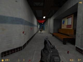
My first released map. A section of lab complex for HLSP.
23 Comments
You must log in to post a comment. You can login or register a new account.

 HL
HL


The rest looks fine.
btw, how many maps were before 1st submitted cos they're right, it does look good
Vi Maj döma från avbilda emedan vi er alltför lat till data överför den utom kanske om din trevlig JAG makt data överför den och hastighet den god.
Hunter: I made a lot before that! I've been mapping since '98 but I never finish them. I'm interested in joining an SP mod team though, HL1 or 2.
I forgot what I wrote though :/
-clean and interesting architecture
+neat lighting--pipes, rafters
-once you get the level 2 card and enter the door, it should say something like "access granted," not 'level 2 card required."
Ok I will speak English now then.