l33t: Conclusive Analysis
 HL
HL
l33t: Conclusive Analysis
by
Rimrook
Posted 19 years ago2005-05-14 02:48:26 UTC •
Completed •
Half-Life
- Name
- l33t: Conclusive Analysis
- By
-
 Rimrook
 - Type
- Map
- Engine
- Goldsource
- Game
- Half-Life
- Category
- Completed
- Included
- BSP
- Created
- 19 years ago2005-05-14 02:48:26 UTC
- Updated
- 19 years ago2005-10-25 12:11:05 UTC
- Views
- 8662
- Downloads
- 1323
- Comments
- 26
- Rating
- 4.50 (2)
- Reviews
- 0
UPDATE: .rmf is included in this zip.
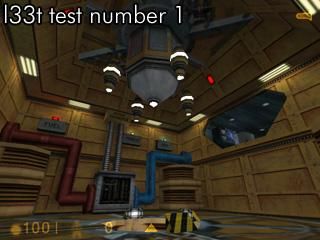
I was playing around with triggers and managed to whip up a quick scenario. See if you can survive. It's kinda easy and I'll update with more difficult scenarios once I make them.
I was playing around with triggers and managed to whip up a quick scenario. See if you can survive. It's kinda easy and I'll update with more difficult scenarios once I make them.
26 Comments
You must log in to post a comment. You can login or register a new account.


Well done!
Nice!
Btw, this map reminds me of making a short tutorial about the angular velocity on func_trains. Awesome thing.
Your map scared the crap out of me when i saw that piece of blue pipe coming towards me. Thank god i quicksafed at the beginning of the map. Lol
-Wooden crates containing some radioactive waste don't look too logical... I'd change em' into containers or somethin...
-The barrels have the same texture all over! Change the top texture coz it looks like CRAP...
-NO AMBIENCE... Try adding something like wind...
-The textures repeat too much.. Almost all of the castle walls have the same texture on them...
-Default sky... It doesn't fit the theme...
-It's de_park - isn't it? Add somethin like grass or trees...
+Pretty low r_speeds for such an open map. I am impressed..
+Decent gameplay In total I'd say that with some graphical tweaking it would become a quite good map... Make a de_park3!
please tell me which map your talking about and i'll forget about it
For starters, did you use env_shootters for the thingies--sprites?--shooting out of the crystal when it touches the env_beams/lasers?
Great sequences and architecture, as usual. Only too criticisms/suggestions:
-Clip in front of the blue and red pipes, so you don't walk up them like stairs.
-Move the center of the big cylinder thingy in the center of the room closer to the ceiling. I looks off center currently, imo.
Otherwise, very fun and of course...1337!
Great job, 1000 pts
Move the top edge of big cylinder thingy--at the center of the room-, so it's closer to the ceiling, and looks more correctly aligned.
but if you were to modernize hl1's technology, keep this in mind. People advance technology by making it smaller and faster, more efficient and safer. That's why this test chamber is a bit different and not as large and bulky as the original. Since it is smaller, they could have four of the revised chambers fit inside the original large chamber.
Just wanted to point that out.
I will release the rmf soon, probably on june 3rd. that's when i'll get home. :
sorry guys, just have to wait, i don't have my comp right now.
x__X
A mini-puzzle to get the reaction started, followed by a bit of thinking and trying things to figure out how to survive.
Very nice use of tracktrains, sprites, lasers, etc., to give it a classic HL1 feeling not found in a lot of maps. The construction of the consoles (angles, mixed textures) was nicely done.
Changes in lighting were very good.
I'd like to see more mini-puzzles like this.
mwahahahahahaaa
ENJOY!!!