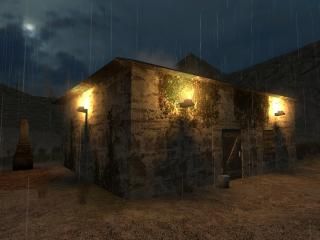
Night Things Zero

Half-Life 2 HL2
Night Things Zero by IMUS
Posted 19 years ago2005-06-09 23:04:38 UTC • Completed • Half-Life 2
Loading...
Screenshot Thumbnail
Name
Night Things Zero
By
IMUS IMUS
Type
Map
Engine
Source
Game
Half-Life 2
Category
Completed
Included
BSP
Created
19 years ago2005-06-09 23:04:38 UTC
Updated
19 years ago2005-07-15 15:37:13 UTC
Views
11605
Downloads
5419
Comments
16
Rating
4.00 (1)
Reviews
0
full star full star full star full star empty star Download

-Update-
This is the second release of this map. I tried to fix up and
change as much as possible. Make sure to comment on it or rate it.

-STORY-
Officer Freeman is sent in to find a madman.

-INSTALLATION-
Extract the zip to the hl2/maps folder then run hl2 hit console
key type "map tntzero"

NOTE If this is the second time you have downloaded the map just
overwrite the past one or delete it.

16 Comments

Commented 19 years ago2005-06-10 03:54:12 UTC Comment #7667
this could of been alot more scarier, and the sewers look like they were made in hl1! update it i like the idea and setting
Commented 19 years ago2005-06-10 03:54:39 UTC Comment #7668
Is the house.....haunted?

hehe, I loook forward to this. There aren't enough HL2SP maps.
Commented 19 years ago2005-06-10 07:50:16 UTC Comment #7670
let alone horror ones, i love these type of maps its so boring playing cs now
Commented 19 years ago2005-06-10 10:01:32 UTC Comment #7673
Great story idea, nice setting, work on displacement, manipulation etc.. to get the terrain more realistic,more jagged, try some better trees, really twisted/ craggy trees would work well.
Commented 19 years ago2005-06-10 16:37:25 UTC Comment #7683
+ Interesting to begin with, the G-Man freaked me out
+ Reasonably spooky atmosphere
+ Some good use of sound

- Looks, well....mostly horrible.
- Very poorly optimized, makes even my uber PC lag like a bitch in places, not good.
- Architecture is largely unimpressive, especially the box around the starting area which is simply atrocious.
- Ending isn't that great, really.
- Scale is wierd in places

Kept me entertained for 15 minutes :)
Commented 19 years ago2005-06-11 00:29:12 UTC Comment #7689
work on the monster placment too
Commented 19 years ago2005-06-15 21:31:24 UTC Comment #7772
It's okay for a 1mb file.
Commented 19 years ago2005-06-17 23:44:26 UTC Comment #7810
I dont know why everyone is coming down on you so hard. I thought it was great. It was quite fun to play, I personally think the monster placement was great. Architecture was a bit boring in the boxy areas, but you did well with details. Those pipes definately made it look better. I like your gullitine, miniture and lifesize. I thought recieving the pistol before the crowbar was unusual but it fit relatively well. Headcrabs around corners are predictiable and sometimes just plain annoying, use that sparingly. Ambience was great, fog, lights, and sound were well used. It was pretty short, and I dont really know how your going to continue the story if gorden just died... Your pillow sounds like a brick, but thats not really a big deal. There are points of low FPS, you should really fix those for nice smooth gameplay. Use "nodraw" texture on any face the player is not going to see. It really makes a big difference. If you supe up your architecture, Im sure your map could look great.
Commented 19 years ago2005-06-18 00:05:03 UTC Comment #7811
Ok, Ive played through it again, and now I have a better list of things to fix and stuff:

The walls of the starting area are tiled, it looks really bad. You should make it look a bit more natural. Same goes for most of the floor. Its so flat, it doesnt look like ground should. Your house is good, not much to improve. Wine celler is very laggy, please fix, its well detailed though. The sewer is a little boring, not sure how to fix it up though. The area with the white fogging pipes and fast headcrab is the same texture over and over. It's quite boring, you should really use more than one texture in every room. If you have the walls and ground the same, use a different ceiling, if you have the same walls and ceiling use a different floor. Vary your textures and it will reward you with stars on your maps. Your architecture is a bit boxy, use circles and arches to make your map look better. Decals are your friend, use blood decals around your bodies and monsters, it makes them look a bit scarier. I've spend a lot of time writing about your map, please return the favor if you could for my unfinished map "Beginning". It's suppose to be a scary map too.
Commented 19 years ago2005-06-18 16:42:03 UTC Comment #7817
I've already updated the outside wall to a mountain range. The pillow will be fix if possible. Gordon didn't die at the end he just got knocked out. I'll comment on your map(Beginning by Vallian88) after I play it. Monster placment will also be changed. As for the sewer you'll just have to wait and see. I may displace the ground, but I really want to keep this a small 2MB file that all can easily and somewhat quickly get. Until next peoples. THX!
Commented 19 years ago2005-06-20 02:20:46 UTC Comment #7836
The update should be up by Wednesday or Friday. I used all the comments as a list of what to fix. I'm still aiming for a 2MB download and better fps. Until next time peoples.
Commented 19 years ago2005-06-24 11:13:01 UTC Comment #7903
Wow dude, much better, the beginning is great with that movie. The walls in the beginning are still tiled and if you could do something about that, it would look much better. I like how you give info through the newspaper, thats really cool. Monster placement is much better. There are times however that the monsters can't reach you. Pipes are in the way or something. I like the new fast zombie, that one is kinda hard with only a pistol, but you should keep it.
Commented 19 years ago2005-06-26 02:56:29 UTC Comment #7925
Nice improvment, the original just didn't do source justice
Commented 19 years ago2005-06-26 03:11:30 UTC Comment #7926
architecture is still mostly boring though. What info through the newspapers? there all the same and have got nothing to do with the map
Commented 19 years ago2005-06-26 03:20:19 UTC Comment #7927
What are you talking about? The newspapers tell a little bit about the madman. I only found two, I wonder if there's more...
Commented 17 years ago2007-01-11 20:00:41 UTC Comment #13971
Wow I just played it, nice use of path_corners for the camera at the beginning :D. I agree with alot of the other guys here, the architecture for the hills/mountains was crappy and rough and could've been smoother. Monster placements were very nice. The architecture and entities in the sewer and under the house was well done. The gman scared me :P. When you go through the trap door to the basement, you have a bit too much smoke, causing lag. The ending sucked rotten eggs :|...though pretty good putting a VCD (valve choreography file) in for the madman (Gregory). But how come the zombies didn't kill the madman?...Overall a 4/5. Well done. Any map made deserves a 3 or higher in my book.

You must log in to post a comment. You can login or register a new account.