cs_penetration
 CS
CS
cs_penetration
by
M0rt@nius
Posted 19 years ago2005-10-16 05:19:16 UTC •
Completed •
Counter-Strike
- Name
- cs_penetration
- By
-
 M0rt@nius
 - Type
- Map
- Engine
- Goldsource
- Game
- Counter-Strike
- Category
- Completed
- Included
- BSP
- Created
- 19 years ago2005-10-16 05:19:16 UTC
- Updated
- 19 years ago2005-10-18 23:41:59 UTC
- Views
- 2216
- Downloads
- 693
- Comments
- 13
- Rating
- 3.50 (2)
- Reviews
- 0
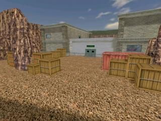
This is a 32 player CS map with large open areas.
Mostly like cs_militia, it has a building at the center with 4 hostages in it and several routes leading into it.
Mostly like cs_militia, it has a building at the center with 4 hostages in it and several routes leading into it.
13 Comments
You must log in to post a comment. You can login or register a new account.


The textures look, like they could use some more work, imo..
My review:
**************
+ Architecture. Pretty good throughout the map, although some of the monitors in the office were invalid solid shapes and didn't show up right.. You could also try replacing some of the crates with something more interesting, or removing them. :
+ Idea. It's like de_train, cs_office and cs_siege put together. Nice
*******************
+/- Layout. It's good, but it's WAY too big.
+/- Gameplay. It's ok, but this map is WAY too big to be a hostage rescue map. Why not change it to es_ or as_?
********************
- Lighting. It's bright enough but it's way too boring.
- Texturing. You gotta work more with this. For a start:
1) Use another cliff texture (a texture that is randomly tiled)
2) Use the asphalt texture from cs_bdog.wad and add some random cracks from the wad.
3) Scale the cliff tecture, the gravel texture in front of the garage to 2.0 or 3.0.
- Ambient sounds. It really needs some! Add some wind sounds in the open areas, and some cpu sounds in the office, maybe some engine sounds to the cars..
************************
Well in total - this map looks pretty impressive. I'm amazed, on how you managed to keep the r_speeds at ~600 at such an open map!!
Although if you want the gameplay to improve - try adding some veichles to the map. Perhaps an APC for the CT's? Anyways - it's in dire need of veichles, cause it's way too big to walk on foot! Improve the map - and it will be a hit!
And there isn't much space for the vehicles to meve around, i.e. if there will be an APC at the CT spawn point then it will only be able to move around the CT spawn point road, which won't be much of a use.
And btw, I dunno why you have problems with the monitors, they suppose to show up correctly, here's the screenshot: http://img371.imageshack.us/img371/4712/qqq3ye.jpg
It has already been said above, but the map is too large. You can compress those curvy roads parts a lot - it'll make the combat happen earlier and that's what most CS players play the game for. Running around isn't so much fun on itself, especially linear routes get boring fast.
The visuals are fine. I like those cars and trains, but at some points these custom textures just clash with the standard ones. The quality levels don't match well. Some textures are also very repetetive (the rocks), scale them up and eventually rotate them a bit so the pattern is much harder to spot. Decals can work well for that purpose, too.
All in all, the map feels somewhat empty and generic at points. The trottoir has the same texture as the road which isn't so good, and the road is perfectly flat and suddenly there's a rock-wall. Usually, there's some sand between these two things.
But, all in all, a nice map, and with work on the layout and the visuals, I can see some great maps coming from you in the future. Just be sure to work on these weak points. Good luck with further maps!
That said, this map has nice architecture/texturing/lighting throughout.
Little big for my taste too, I would never play a map like this.
You obviously have some skill, why not building something a little smaller, and a little less cloney
***