Headcrab Revenge
 HL
HL
Headcrab Revenge
by
Darth Duvet
Posted 19 years ago2005-11-15 05:39:49 UTC •
Completed •
Half-Life
- Name
- Headcrab Revenge
- By
-
 Darth Duvet
 - Type
- Map
- Engine
- Goldsource
- Game
- Half-Life
- Category
- Completed
- Included
- BSP
- Created
- 19 years ago2005-11-15 05:39:49 UTC
- Updated
- 19 years ago2005-11-17 13:02:40 UTC
- Views
- 6418
- Downloads
- 1020
- Comments
- 19
- Rating
- 3.44 (9)
- Reviews
- 0
Headcrab Revenge
Remember the first time a headcrab jumped out on you, well now is your chance for revenge.
Eight deaths, infinite headcrabs, hours of fun.
This is one of my first proper maps so I hope you enjoy it. Depending on its success I may make an extreme version sometime next year.
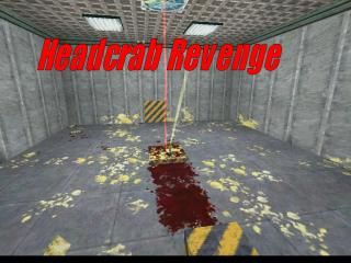
Please note this map is NOT 'fullbright', but my screenshot wouldn't come out any better.
19 Comments
You must log in to post a comment. You can login or register a new account.


are you sure?
its a first map Saco - chill! could be a bit of fun
I managed to, umm, crash it, by hitting all the buttons at the same time (going down the line), the puncher that came out of the backwall got stuck and headcrabs got spawned to the right. But I loved it
(or watch Tom & Jerry )
awaits version 2
And some of the traps were stolen, but if it's a first map - then it's really great. The hammer was very nice. You could have made a locked door, showing the player, how he got there.
Anywho - great first one.
Nice job. Quite amazing for a first map.
I agree that maps such as these probably would be better placed in the "Example" section.
+ Nice traps I liked how you made these props.
+ Nice texturing on the props.
+ Entitywork was good too! I liked the hammer that it's two parts are well aglained.
First trap: Nothing special, just another explosion...
Second trap: A turret. Wasn't intresting!
Third trap: Poisnios blood shooter! W00t. Really strange. You probebly used a trigger_hurt.
Forth trap: Just another lazer beam. Nothing to see.
Fifth trap: Trap doors below the headcrab! I liked it. Watch them fall.
Sixth trap: I liked smashing them too! Probebly a func_door.
Seventh trap: A hammer. Cool one! How did you make the upper part folow the lower part of the hammer? Nice entitywork.
Eighth trap: Big spikes from the sides... stab it to death, or to gibs!
I was really fun and the traps are good. I'll give it three since the rest isn't that good:
+/- Texturing was ok. No misaglainments but the textures on the walls are streched!
+/- Lightning was ok. It doesn't need complex lightning so white bright light is good.
- Blocky artitcecture. Only two blocks connected together!
+ Concept: The whole concept itself was amusing :).
+ Traps: The traps themselves were excellent, nice entity work!
- Architecture: Very bland and blocky.
- Texturing: Again, very bland.. and they're stretched.
- Lighting: Although it looked fullbright it actually wasnt... turn down the properties of the lights a bit!
It's fun for a while but then it tends to get boring. 3 from me.