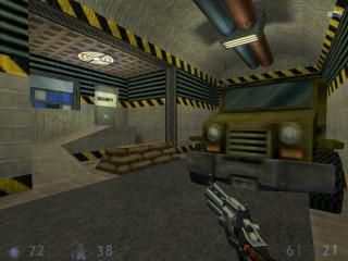
Apprehension
 SC
SC
Apprehension
by
HeAdCrAb KILLA
Posted 18 years ago2005-11-20 15:59:43 UTC •
Completed •
Sven Co-op
- Name
- Apprehension
- By
-
 HeAdCrAb KILLA
 - Type
- Map
- Engine
- Goldsource
- Game
- Sven Co-op
- Category
- Completed
- Included
- BSP
- Created
- 18 years ago2005-11-20 15:59:43 UTC
- Updated
- 18 years ago2005-11-25 15:43:01 UTC
- Views
- 3443
- Downloads
- 1047
- Comments
- 16
- Rating
- 4.00 (4)
- Reviews
- 0
Well, I finally worked out all the bugs in this one and it came out great! The map has been done for some time now but I was stuck on some little things. I also had to restore my system which also took some time out of working on it. Anyway, I worked hard on this one and I payed a lot of attention to gameplay. I think it's pretty solid. If you liked Opposing Force you'll absolutely love this (SVEN Co-op) map! The map also contains custom models and textures. Enjoy!
16 Comments
You must log in to post a comment. You can login or register a new account.


Anyway, I played it yesterday, and i enjoyed it. Those Robot Soldiers are kinda cool. But some area's feel somewhat crowded. Geuss what happend when 16 people are ingame!
Keep going!
+ Gameplay (very nice imo)
- Texturing
- Architecture
3/5
+ Layout it was easy to learn it. Because the map is cercular, you managed to make it long. Dispite of it's leangth you can easily and quickly travel from the start to the last point you were in.
+ The Gameplay was mostly good. There was lots of space to menouver, exept for the room with the grags which was incredebly small for two grags. And there are lots of stuff to take cover behind.
+ Overall the lighting was good. There is lots of contrast between the colors,darkness and lighted areas. You didn't over use colors like red. The most annoying bit was in the outside area where there aren't any lights. It is pitch black...too dark. At list make a really dim blue light but this is too much!
+ Weapon placment I great. The weapon spots aren't too far from each other and aren't too close. There isn't too much weaponry/health in those spots. I rearly had a lack of ammo, which is good, I hate being stuck in combat with only a crowbar.
+ The details were great! I liked the cars and trucks. Really adds alot to the map. In some places.
+ The terrain work wasn't bad. What you did is great and it doesn't need to be improved.
+/- Monster placement was sometimes and good sometimes not! There was enough room to fight against the X-races. And you didn't place too much of them. The voltigore chased me through all the corridoes till the starting point where I killed it. Most of the grunts were killed by the X-races, didn't have a chance to fight against them! Some of the monsters were placed on platforms(like th robo grunts) and I could have stand below them and shoot them with out getting hit! That room was too small for two grags and I could run to the place with the RPG and kill them from far away.
+/- The artitecture was really great in some places and in some abit blocky. Try adding exutions to walls and make them look better. Also detail makes bad artitecture less noticible. Also avoidi using too long/big blocks, repitiveness makes maps look bland and boring.
+/- The texturing was really good in some places and in some other places ok.
It's a good map. It's a shame that in someplaces you didn't work hard as on others.
I don't really know what to suggest for this map, I thought pretty much every are was covered very well.
My favourite room was the "break room", which looked excellent. I especially liked the way the overhead lights were done, and just the design and texturing were perfect for that room!
I played this in regular half-life so i'm sure a lot of things didn't work properly, but it was still great.
Some more random thoughts:
+loved the trigger that made the car flip over and spill the radio waste--or was that just another part of the map?!
+loved the little garage with the toobox
-Nice func_tanks, but I would turn down the pitch/yaw rate a little, that IS a .50 cal remember, and it would be too heavy to move around so fast.
+that area with the func_tank .50 cals looked superb also.
-Was it possible to unlock the door with the retinal scanner?
Great stuff!
5 stars imo!
i can't find it anywhere