aim_black_and_white
 CS
CS
aim_black_and_white
by
=[Symmetry]=
Posted 18 years ago2005-11-30 15:06:35 UTC •
Completed •
Counter-Strike
- Name
- aim_black_and_white
- By
-
![=[Symmetry]=](https://twhl.info/uploads/avatars/inline/718.jpg) =[Symmetry]=
=[Symmetry]= - Type
- Map
- Engine
- Goldsource
- Game
- Counter-Strike
- Category
- Completed
- Included
- BSP
- Created
- 18 years ago2005-11-30 15:06:35 UTC
- Updated
- 18 years ago2005-11-30 15:06:35 UTC
- Views
- 1751
- Downloads
- 554
- Comments
- 13
- Rating
- 3.83 (6)
- Reviews
- 0
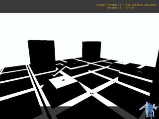
aim_black_and_white
Just did a little aim map. With only black and white textures... ^^
Just did a little aim map. With only black and white textures... ^^
13 Comments
You must log in to post a comment. You can login or register a new account.


Downloads *
But it sure do look kind of cool... A map i would like for sure but i wont downlod! i wont! i just wont!
It was a good map, I liked the theme and the shapes were cool, I still think a car could make it a bit more interesting e.g. a cyber car
I'll give it 4/5 as only really complicated maps that look really good and also have had a lot of work on deserve a 5.
Why not make some traps? Like you could fall off the edge of the map into the white void, or like some white or black areas could be func_illusionary, thus making the player fall down.
The gameplay was ok, so was the layout.. Nice work
Architecture (+) There was nothing super special but the architecture was generally nice and well thought out.. suitable for an aim map.
Lighting (+/-) erm, yep....
gameplay (+) It's quite big but also quite fun... The players contrast very much to the white and black so no missing them.. However, my head started to hurt after only a few rounds..
Texturing (+) Very well done, even if it is only with 2 textures.. Thought out and good.
Overall (+/-) A very fun idea but really, choose less contrasty colours... my head is pounding.
+ Architecture, it was very basic and geometric, but it looks very nice.
+ Gameplay, very fast paced, wich is fun.
+ P90 ONLY!!!! Do I need to say more?
+ Good placements of kevler and grenades, a little dangertrap at the grenades by jumping to it in open field.
+/- Texturing, nice, just nice. Eyes hurting after a while thought.
+/- Lightning, I just love the black and white theme, but it kinda hurts your eyes after a time of playing.
- The tunnels below your feet, meh, I thought I was going to fall down in the beginning. Still, once you know that, it looks very cool.
- Ambience. It would have been fun with some.
Still 3 stars
Radical weapons equipping, I must say. you cycle through the submachine guns, and the finally the colt and AK, and then no more.
Though the blinding white and hideous black are a bit trying on the eyes, but I guess that was the point :0
+nice little symmetrical layout
+Radical weapon equippage!
-little trenches served no purpose I could see
-make the towers climbable perhaps?
I'm going 4 on this map, just because of the innovative way you get your weapons
Nice job!