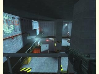
dm_storage_facility
 HL2DM
HL2DM
dm_storage_facility
by
cybox
Posted 19 years ago2005-12-22 17:21:19 UTC •
Completed •
Half-Life 2: Deathmatch
That's a HL2-Deathmatch map, but it looks like HL1  I made this map last year under HL1,
and now I converted everything to run under the Source Engine. So this map uses old HL1-Textures,
but Models, Decals and other Stuff are from HL2 Of course all new weapons too. Take a look at this, and have some fun
  Merry Christmas !
 I made this map last year under HL1,
and now I converted everything to run under the Source Engine. So this map uses old HL1-Textures,
but Models, Decals and other Stuff are from HL2
 Of course all new weapons too. Take a look at this, and have some fun
  Merry Christmas !
5 Comments
You must log in to post a comment. You can login or register a new account.


The most noticeable flaws are also related to light. It seems like this map could have made great use of lightmaps, since shadow resolution seemed very poor in some areas. If you are converting a map to Source, you should take advantage of those things. Some props were lit strangely (too bright compared to the world brushes around them) but that's hard to control sometimes.
I would also change the sprites under the fluorescent lights. Some other people have tried to use them but they always look wrong.
Good map but the textures just don't do it for me. HL1 textures just don't fit with HL2 style lighting or light effects. Maybe consider retexturing it with something that fits the lighting a little more.
I did like the hl1 textures in hl2 thought, makes it feel like classic HLDM!
The weapon placements, lightning and texturing were very good.
But the lay-out and gameplay, mmmmm, I don't know..
The map is pretty big and the lay-out confuses me a bit.
Also, I don't think the flares fit this map like they did in your other map, rusty..