Razorback
 HLDM
HLDM
Razorback
by
Windawz
Posted 5 years ago2020-03-03 22:50:33 UTC •
Completed •
Half-Life: Deathmatch
- Name
- Razorback
- By
-
 Windawz
 - Type
- Map
- Engine
- Goldsource
- Game
- Half-Life: Deathmatch
- Category
- Completed
- Included
- BSP, RMF/VMF
- Created
- 5 years ago2020-03-03 22:50:33 UTC
- Updated
- 4 years ago2020-10-02 19:58:37 UTC
- Views
- 4506
- Downloads
- 913
- Comments
- 5
- Rating
- 5.00 (4)
- Reviews
- 0
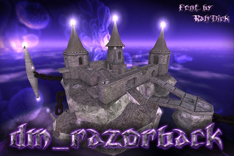
An HLDM map I've made being heavily inspired by Peter Hajba's Razorback, a track from Unreal Tournament 99. I wanted to show my idea of what it'd look like as a 3D environment. The map is a floating island in the middle of nowhere, with a fortress embedded into it. Lots of spikes, metal, rock and blobs of arcane energy all over the place! Enjoy!
Spawnpoints: 16.
All the info is in the README file.
Spawnpoints: 16.
All the info is in the README file.
5 Comments
You must log in to post a comment. You can login or register a new account.


Architecture was really great. Map was very vertical with lots of places for jumping around. Weapon placement could use some tweaking, though, I feel like it's hard to get my hands on a decent arsenal.
It had a lot of really cool little touches like the crystals doing a color correction effect and the chains swinging in the breeze. Definitely a map I'd like to see in circulation whenever we do HLDM.
So good that it crashed my game when ribcage whacked me with a crowbar. Amazing.
CONTENTWATERtool texture to make the lamp holders one-plane instead of four. The same trick has been used on small chains. I have also tried to control the splits with setting proper detail levels on func_details but I didn't inspect the results a lot, so there may still be mistakes and unnecessary splits.There are two main problems, though. The former is that the
BEVELtexture is applied in-between many of the triangular prisms which compose the island's terrain. Simply put,BEVELhelps to improve collisions in certain cases like this one. But at the same time the splits on the terrain must be terrible, partly due to the compilers' fault, but also partly because I didn't useSOLIDHINT. This tool texture lacks the advantages provided byBEVELand mostly works likeNULLbut helps the compilers split the geometry better in some cases. To be honest, I'm the one to blame here - some terrain pieces still haveNULLin-between the triangles.And the latter problem is the openness of the map. It's a "void map" (or so they refer to that kind of maps in one of Quake 1 mapping communities), which means that you can barely block visibility for players, therefore a lot of geometry is considered potentially visible and gets rendered.
I wish I had the willpower and the skill to optimise it further, but for now 3500 wpolies on average it is.
I plan on maybe rolling out a patch (which will be pretty useless because it's too late, the map has already been downloaded many times), and even then I doubt that I'll alter anything crucial about the map. As someone said in some thread on this website: "Fix your mistakes in your future works". You may take it as laziness but I certainly want to finally be done with this map and move on.