Poltergeist
 CS
CS
Poltergeist
by
Soup Miner
Posted 19 years ago2005-12-24 04:02:50 UTC •
Completed •
Counter-Strike
- Name
- Poltergeist
- By
-
 Soup Miner
 - Type
- Map
- Engine
- Goldsource
- Game
- Counter-Strike
- Category
- Completed
- Included
- BSP
- Created
- 19 years ago2005-12-24 04:02:50 UTC
- Updated
- 19 years ago2005-12-24 13:20:17 UTC
- Views
- 3818
- Downloads
- 983
- Comments
- 9
- Rating
- 4.50 (2)
- Reviews
- 0
I'm happy to say that after more than 3 months I've finally finished this map. Nothing much to say. I consider the brushwork to be amazing. Except for the living room, be ready for that because it will make your eyes bleed.
Dec. 24 : Included the sprite that n00b#2 was talking about.
Dec. 24 : Included the sprite that n00b#2 was talking about.
9 Comments
You must log in to post a comment. You can login or register a new account.


*****************
+ Architecture. When you said that the brushwork is amazing - I expected to see more than just awesome detail and curved corridors ;)The architecture wasn't very amazing, but it was quite good for a CS map. I loved the detail throughout the map. The DIE sign, the kitchen, the fireplace.. Lovely detail.. ^^ ALthough I hated the default HL prefabs. Please remove them or at least re-texture them.. The default bed textures also sucked donkey balls.
+ Atmosphere. To be honest - I haven't seen a map with such pwnage atmosphere for a VERY long time. The dull lighting, the sounds, the blood, the trap in the bathtub
All those corridors with the wind sounds.. Aaah.. Lovely, just lovely.
*****************
+/- Lighting. The only problem is that it's way too dark for the map to play right. I'd suggest making the corridors brighter, even if that would make the atmosphere less creepy.
+/- Gameplay. Lots and lots and LOTS of routes to the goal. The gameplay would be ok, although the complex layout and the hostage placement make this map very T friendly. I'd suggest placing the hostages somewhere near the T spawn. You could place them in pairs in 2 rooms, or perhaps place one pair near the T spawn and the other near the furnance in the basement.. (I loved tht place)
************************
- Layout. Sorry, but this is the only thing that doesn't work in this map. It's way too complex, so if you wanna keep it that way, you should make some signs, pointing the player to the goals. (they really help) You should also alter the hostage placement.
- Texturing. Some of the textures were alright, but I'd say that this map is begging of more custom, creepy textures. The outside of the house could use some re-texturing, so could the hallways. I also hated the default prefab textures on the beds, sofas, bookcases...
**********************
Overall - a truly spooky map. I loved the way you did the bathroom trap. Really creative..
The rooms look a bit empty, tho.. I'd love to see some tall bookcases, large windows, old-ish curtains and old-ish armchairs that would make thie house look more like a spooky mansion, dig? ;P
There could be some bloody knifes or other scary stuff in the kitchen, like blood leaking from the sink.
Anyways - great map! 4* for the atmosphere..
sprite1/fire.spr not found. Im trying to fix it but yea....
By the way the only prefabs I used were the chair and bookcase in the living room. Everything else was all me, not sure what you mean by "default prefab texture on the beds" but if that means means you think I used a prefab on it, no, it was my own brushwork.
Thanks for the input, very much appreciated!
and hence i solved the problem.
but overall nice map
i dont care to do those long reviews on brushwork and what not. It's very impressive i must say. I still love it when you hear footsteps.
sprites1/fire.spr not found.
+Deatail work outside was great--shutters varied, fence, lamps, porch railing, cute shrubbery, all very nice. +Nice ambience and fog outdoors, to go with the env_rain.
-some face splitting in the outgrounds: where the soil meets the fence, looking away from the house front right, there is a big diagonal one, and in the bloody cross birdbath
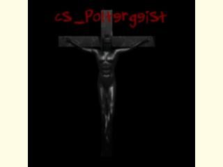
-neat jesus model
+Lots of nice dark places--perfect nightvision map!
+many routes to the basement an d the hosties which is really nice!
+The Foyer is spectacularly done, but could possibly to with some "nicknacks, or paintings, couches, curtains etc. Still, really nice as is.
+Blood puddles/pentagrams/scary paintings are a nice touch. You might make the blood puddles not so uniformly round though, and could you incorporate a sprite rendered almost translucent with the spooky paintings to make them ever spookier perhaps?
-Glass out front doesn't break, but you can still shoot through it so that's cool.
+View from atop the balcony is excellent! Well done!
-bathroom has some great detail, but could use a bit more imo. I love how jumping in the tub kills you! you might consider adding a window to the bathroom too, and when you look out, something scarry happens...
+Nice message in the master bedroom! Beautiful brushwork! Bed is scaled a little big. Nice ambience with the tv. Nice detail items, but like the bathroom could use a bit more imo.
+Basement is great, but the layout is a little confusing with no landmarks. All the walls look the same, so it's easy to lose sense of where you are, but this is a house of horrors, so I guess that's ok
+Nice Easter egg!
An excellent map, your best so far imo. Great ambience, texturing, architectue, and detail in most places. I would love to play this map on a server.
Great job!
5 stars
Overall, this map looks interesting, but still needs a bit work.