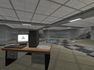
dm_breach
 HLDM
HLDM
dm_breach
by
Jax
Posted 18 years ago2006-03-15 03:38:00 UTC •
Completed •
Half-Life: Deathmatch
- Name
- dm_breach
- By
-
 Jax
Jax - Type
- Map
- Engine
- Goldsource
- Game
- Half-Life: Deathmatch
- Category
- Completed
- Included
- BSP
- Created
- 18 years ago2006-03-15 03:38:00 UTC
- Updated
- 18 years ago2006-03-15 07:36:48 UTC
- Views
- 4689
- Downloads
- 1143
- Comments
- 14
- Rating
- 4.25 (4)
- Reviews
- 0
My HLDM compo entry (3rd place!) and return to mapping after... a year and a bit?
I am contemplating continuing work on this map so constructive feedback is wanted!
I am contemplating continuing work on this map so constructive feedback is wanted!
14 Comments
You must log in to post a comment. You can login or register a new account.


I'm not very good with doing all the shit and telling you what to change but I'll give you a 4 because it needs a bit more improvement In some areas. And the dead medkit is a bit to thick, I'd say make it a bit smaller.
1. readme.txt ain't gonna get into my folders, thankyou.
<there were many maps that had either a readme.txt or none at all, instead of a mapname.txt.>
2. Good first impression. Solid theme and style (with the exception of the CS part).
<The CS part, though a funny touch, broke the theme a bit for me, and it was just a small single room with only two paths leading to it - pretty predictable combat there. About the theme, perhaps linking a testlab to an office isn't really normal... the map feels consistent overall but there are some grips to this.>
3. Some annoying hindrances: the CS players detract, the doors that slide open are slightly obstructing (what purpose do they really serve? what positive?). Some invisible barriers and weapons/charger placed in unreachable area's (a real letdown).
<I remember someone commenting on my map Detention that the broken ladder up on a buildings side really attracted them, but when they gauss-jumped up there and found it was just a 'detail', they were disappointed.>
4. Lack of height. However, looks like a fair layout.
<I would really add some more play-levels to this if I were you. The map feels 'low', too.>
5. Lacks ambient sound - the electric crackle is overused and gets annoying, while there's a few machines that could do with some sound.
<I assume it's a military surrounding by looking at the ammo crate and weapons outside, so why not add some gun-fire to the background? And some subtle (!) computer sounds and such... taking the electric crackle out or reducing it's volume greatly...>
Conclusion: Nice first impression, but some things just sting a bit. Not as good as could have been.
+unprecedented amount of detail work for a dm_map
+Good performance--I only noticed the wpolys going above 1000 once...
+Great vistas--terrain outside the office-style windows, laser room, etc.
+superb, interesting architecture throughout--hallways, stairs, railings--all very well done.
+fresh textures! A new keyboard texture!--and many more through this map
+neat layout with varied relief, and ceiling heights--refreshing!
-severely lacking in ambience--pretty much dead silence throuhout the level...Add some!
-Layout is right on the cusp of being too big. You might consider truncated it a bit, but most certainly I wouldn't make it any bigger!
All in all, subperb work!
Great job and congratulations!
The outside areas you're refering to--unless you become more specific--, I think was in the 600-800 range, which is not even remotely high
I forgot to ask, is there a way to get the egon gun, or some of the other seemingly inaccessible goodies?
Muzzle: Thankyou, Ill come in for a game when I have some spare time.
rowleybob: Most of the inaccessible things you can't get to, and are just to tease you
I love the map. Good things Bad Things. I agree that it is much too mazelike.
If you dont have enough people playing i can see how this can get very boring very fast.
NO egon ;(
I like the level edges. Very smoothly put together, except these 2:
http://i22.photobucket.com/albums/b329/tetsuosho/dm_breach0000.jpg
and
http://i22.photobucket.com/albums/b329/tetsuosho/dm_breach0001.jpg
You can see The glass. Might wanna Null That. And the cracks in the rock caught my eye in the first place.
Minus 1.5 points.
Other places:
http://i22.photobucket.com/albums/b329/tetsuosho/dm_breach0002.jpg
Such as the Gauss trap. I like. Adds danger as well as to the open... ness of having to put your back to 2 flanks in order to get the gun. PLUS the laser.
5 points.
You took an idea from my map. Completley un intentional but oh well
http://i22.photobucket.com/albums/b329/tetsuosho/dm_breach0003.jpg
-2 points.
Amazing Detail on the FLOOR of all places. I love it. My jaw dropped XD
http://i22.photobucket.com/albums/b329/tetsuosho/dm_breach0004.jpg
+11 points
Love the Vending machines, Love the Room transition. Love the lighting .. ceiling.. hornet launcher...
http://i22.photobucket.com/albums/b329/tetsuosho/dm_breach0005.jpg
+4 points
Point total : whocares, you get 5 stars.
Our forums do not support HTML. The forums support BBCode, and the map vault supports nothing. By the way, you may want to learn XHTML.
@ Admin: can u fix them??
+texture usage.
+Well lit
+CS Cameo
=Size or scale of the map.
-doors, but there alright.
****'s
There are some spots in your map with somekind of strange invisible wall. Its not really a wall, but more like an invisible obstacle. You can still walk through it, but it feel like having somekind of lag. Can't really explain it.
Hunter?
There was an invisible wall some sort of.But as Muzz said there is a bugglitch near the gauss gun.