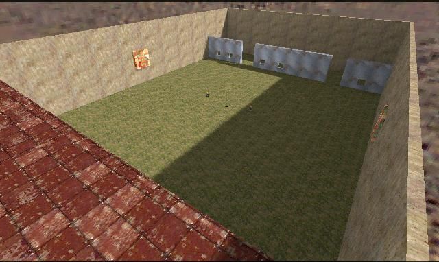
sk_Sniper
- Name
- sk_Sniper
- By
-
 sarwan
 - Type
- Map
- Engine
- Goldsource
- Game
- Counter-Strike
- Category
- Completed
- Included
- BSP, RMF/VMF
- Created
- 18 years ago2006-03-19 05:00:21 UTC
- Updated
- 18 years ago2006-03-20 11:38:32 UTC
- Views
- 1594
- Downloads
- 522
- Comments
- 14
- Rating
- 1.00 (4)
- Reviews
- 0
This is my second map. Do you like it?
14 Comments
You must log in to post a comment. You can login or register a new account.

 CS
CS


They are on your menu bar to the left, it is best to start on the real basics before making a map like this that has many problems.
Its shit. Its a box, its 4 textures. Its appaulingly bad and doesnt deserve to be in the map vault.
Dont submit maps until you can at least create a series of rooms connected by corridoors. Nobody will download this, especially since you commented on your own map
I ain't gonna d-load this one ether.
Not because of the screenshot, not because of the comments above.
I simply don't got CS
I could't agree more!
Um, ok what the hell. Not much to comment about for this map, but I must say I liked the "red" part with the double levels. Paste in one of your nicely consructed func_ladders, and make a nice terrace on the roof!
The "grey" side is 3 walls with windows in them--which were quite nice btw! This side needs something. Anything.
If you're going to make a map like this, I would recommend including some func_vehicles like in de_starwars or he_offroad. Maybe include some func_tanks of some kind of gimmick, or stronger theme!
Can't wait for your next map in the sk series
Sarwan, you are only a begginer, maybe you aren't a great mapper now, but if you'll try you'll quickly turn to be a great one.
Remembering his words..."Its shit. Its a box, its 4 textures. Its appaulingly bad and doesnt deserve to be in the map vault."
I can't describe it more perfectly.......
Just two words now: IT SUCKS