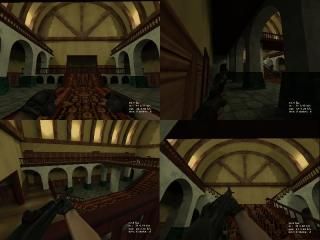
PANDEMIC Main Hall

Half-Life HL
PANDEMIC Main Hall by dragons
Posted 18 years ago2006-04-02 00:57:32 UTC • Unfinished • Half-Life
Loading...
Screenshot Thumbnail
Name
PANDEMIC Main Hall
By
dragons dragons
Type
Map
Engine
Goldsource
Game
Half-Life
Category
Unfinished
Included
BSP
Created
18 years ago2006-04-02 00:57:32 UTC
Updated
18 years ago2006-04-02 00:57:32 UTC
Views
2733
Downloads
1126
Comments
14
Download (Hosted Externally)

This is the main hall of the mansion for my PANDEMIC map for Sven-Coop. This map currently only works on Half-Life, so run it in Half-Life. I would also like to note the rspeeds are pretty bad, but I haven't done any serious optimizations yet, so they should be down in later versions. Any feedback is appreciated. Extract to your valve directory.

14 Comments

Commented 18 years ago2006-04-02 03:41:24 UTC Comment #11412
Well it looks very nice, it's little wonder rspeeds are so bad with all those smooth arches and the scale of the ceiling. You should really change the wooden floor texture, it looks far to repetitive with the shine on it.
Commented 18 years ago2006-04-02 10:38:55 UTC Comment #11415
Yes, I'm cutting down on all the polygons. Though I've used the same style of ceiling in other maps with good rspeeds.
Commented 18 years ago2006-04-03 05:41:52 UTC Comment #11419
This looks really nice, but I have to agree with Strider about the wood floor texture. Remember to turn that flash of when taking texture pictures! The blending on the wood floor and wall textures is also a little poor. One last thing: that song included has the same filename as an original one. Change it!
Commented 18 years ago2006-04-03 19:46:28 UTC Comment #11422
I cut down on the r_speeds drastically and now it runs at a considerable 100 fps in 90% of the map. The other 10% runs at about 80 fps. I did change the floor texture and Halflife recognizes Half-Life01.mp3 as the 2nd track on the cd. I do not know how to use an mp3 otherwise.
Commented 18 years ago2006-04-04 12:13:08 UTC Comment #11423
You could use the method that involves placing several ambient_generics around the map. It couldn't be an mp3, though.
Commented 18 years ago2006-04-04 12:25:14 UTC Comment #11424
Ok, so after I played it again, I didn't notice the different floor texture... looked exactly the same to me. Also, this would just be for a little realism, but it says in the beginning that you come through a door, and it dissapears behind you, but when you turn around, the wall is curved where the door would have been. It's not likely there would have been a door on a surface like that (I've never seen a door mounted in a curved wall).
Commented 18 years ago2006-04-04 15:48:25 UTC Comment #11425
It didn't feel very..hmm..mansionish to me. It sort of felt like i was in like a museum or something. From the looks of it, it seemed like you built the main walls and the ceiling, and then filled the room up with stuff. Try building realistic layouts and rooms, and add off of those. Having a set constraint takes away from the potential of the map. I dunno, if you cut the huge ceiling off, I might of had a different opinion. That ceiling just doesn't say "mansion" to me.

Also, if you are looking to make it scary, you might want to try a different color scheme. The colors of the textures you are using are very..hmm..warm and comfy. Make the lighting darker, even sometimes akward. If you are going to keep the curent lighting, make sure to light the areas under the walkways, I thought I saw doors under there, and make the ceiling not so bright and overpowering. -Just a little idea, have a board squeek when you walk on it every now and then.
Commented 18 years ago2006-04-05 17:12:25 UTC Comment #11433
Looks great, and neat music mix...but 5000 wpolys!!!

You get the rowleybob award for highest wpolys :P

Some very nice architecture that would probably be better done in source ;)
Commented 18 years ago2006-04-05 21:20:15 UTC Comment #11435
Thank you very much for the comments, it's helping me immensly and yeah I've cut down the wpolys so they're "ok" Right now, the highest wpoly i get is around 2000.
Commented 18 years ago2006-04-05 21:26:59 UTC Comment #11436
Sorry for double post, but does anyone have any suggestions on how to map realistic places. I don't have much experience in mapping like this. I map mostly abstract and futuristic type things (which will come in useful later in the map).
Commented 18 years ago2006-04-06 03:25:14 UTC Comment #11438
come up with your own realistic demensions, like 64x112 for doors, 8 unit height for stairs, etc. Having "real world" textures that haven't been edited a lot can also help. Think about what real places normally have in them, go into stores, or just around your house, and look for the things you don't ordinarily notice, then try and use them somehow into your map.
Commented 18 years ago2006-04-06 16:48:00 UTC Comment #11444
Think about a game you have played that had a mansion or chateau or something in it. Return to castle wolfenstein had an excellent chateau. They Hunger had great mansion chunks as well. Also when designing something that might look realistic, it helps to draw it out first, and really think about it. Basically you're designing a freaking house lol :) Imagine if there was an exterior, if the mansion was built on slopes would there be any rooms that dip below others with stairways? What I'm saying is make it architecturally interesting, instead of being symmetric.
Commented 18 years ago2006-04-12 09:31:45 UTC Comment #11487
Thank's for the suggestions. I have been looking at images and looking around and I'll probably end up modifying this map extremely or just starting over. I'm trying to make some phototextures, but my camera broke, so I'm working with the scrap heap of pictures I have.
Commented 18 years ago2006-04-12 14:27:52 UTC Comment #11490
hmm, I wasn't so sure at first, but i like this map. I like the ceiling, although i doesn't feel like a mansion - weird, i know, it just don't feel right, even though it looks great!

I like the up-lighting, suits it perfectly, and although you've got a bit carried away with arch faces, the result is excellent. Don't give up on this, it has potential. just needs some inspiration - maybe some photos of mansions, and some furniture,etc for the main areas, really bare.

You must log in to post a comment. You can login or register a new account.