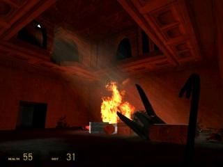
Mansion
- Name
- Mansion
- By
-
 Gunter
 - Type
- Map
- Engine
- Source
- Game
- Half-Life 2
- Category
- Completed
- Included
- BSP
- Created
- 18 years ago2006-05-18 23:15:16 UTC
- Updated
- 18 years ago2006-05-19 00:27:08 UTC
- Views
- 6221
- Downloads
- 2188
- Comments
- 13
- Rating
- 3.00 (3)
- Reviews
- 0
Finally, it's in the vault.
I started this map about four months ago, but ditched it because it was too laggy. Later, I came back and fixed it up and now its running fine.
This is my first source map, it also happens to be the first map I have ever finished. There are a few things that I probably should have made better, but I'm just to effing tired of working on this map to fix it any more.
Have fun shooting random crap.
EDIT: well, crap. turns out I might have hosted the wrong file.
EDIT: ok, I hopefully I got the right file this time.
13 Comments
You must log in to post a comment. You can login or register a new account.

 HL2
HL2


Anyways..suppose Ill review what I played
+Atmosphere -- Seemed dark and night time and spookey
+AI was decent, made me conserv ammo and such
+Its simple yet fun
-Got to the pit and died in a buggy'ish way (B&W and slow)
+/- Arcitecture seemed square in parts yet good in others
Overall I liked it though
The architecture was way to square and didn't really make sense.
The interior didn't make sense either, there was just 1 linear path to go. Put some doors on the wall to make it look like there are multiple rooms.
The ground was to flat. Add some "displacements" to make the ground more realistic.
Read some tutorials on how to 3D skybox so you can make the scenery outside the map look realistic.
For a first map it is pretty good, but make sure to read on optimization!
Trust me, if it was like it was before you wouldn't be playing it.
- To fail to keep up a pace; straggle.
- To proceed or develop with comparative slowness: "The electric current lags behind the voltage."
Lag doesn't just mean "Internet Connectivity Latency" That is a common misconception. I can't stand it when people try to outsmart others for no reason. (Im guilty =D)You know Gunter, Just for you, I will look at this when I get a chance.. I love spooky stuff.
After I closed music and hammer it ran fine
+/+- slow mo but it didn't trigger right and just got me killed
-lacking in detail (e.g. that room with the single combine)
-snipers...cool it a little?
-can't see, it is to dark in tunnels/pit area
-water wasn't appearing
+/- perhaps a few to many combine ehh?
+/- those little round blue electric things that roll after you are annoy since they follow you so long. Gavity gun or a easy place to push them into would help
+/- that area with the strider look interesting, how come I couldn't get there?
+/- the suprise traps were... suprising and deadly.
Well, after the slow-mo section you go through the tunnel in the side of the room. After that you swim through the sewer tunnel and kill the zombie thats underwater. The rest is pretty easy to figure out.
Why? well....
Architecture gets a 4/5, pretty well-done. But the outside architecture it a bit blocky. I would give it a 5/5 if you put in some land in the background with a skybox cam.
Gameplay gets a 2/5 because theres no plot? Also the no water showing up gets on my nerves :P. The part where there is combine rollermines and you not having a gravity gun is kinda annoying. The worst part was it was TOO dark, having to almost always have a flashlight, and it was really annoying going down a tunnel with combine rollermines chasing you and fast zombies in front of you. There was too many combines and combine snipers in the beginning also, having only the shotgun and crowbar too. The only real kool thing to this was that scene where the part of the building falls and a headcrab cannister comes out through the ceiling crashing into the ground o.0 all while in slo-mo and a gray screen.
Proffessionalism (world entity placement, and overall bugs in the maps) gets a 3/5, it would get a 4/5 if the water worked, then a 5/5 if the gray went off after the scene with the headcrab cannister. Having gray throughout the rest of the level is annoying.
Gameplay and having no bugs and wrong things (proffessionalism in my words) are the most important things in maps. So overall, pretty much a 2.