dod_bunker_warfare_v1
 DODS
DODS
dod_bunker_warfare_v1
by
ichebu
Posted 18 years ago2006-10-10 19:20:55 UTC •
Completed •
Day of Defeat: Source
- Name
- dod_bunker_warfare_v1
- By
-
 ichebu
 - Type
- Map
- Engine
- Source
- Game
- Day of Defeat: Source
- Category
- Completed
- Included
- BSP
- Created
- 18 years ago2006-10-10 19:20:55 UTC
- Updated
- 18 years ago2006-10-10 19:20:55 UTC
- Views
- 1553
- Downloads
- 518
- Comments
- 5
- Rating
- 2.00 (2)
- Reviews
- 0
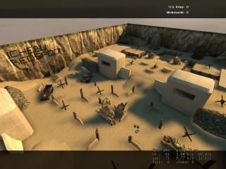
Careful as you run accros the battle field! There are mortars that land in the middle of the battle field at random times. Great map for a snping fest, or set up for assault. Currently playing at: 8.6.9.10:27015
5 Comments
You must log in to post a comment. You can login or register a new account.


Pros:
The mortar blasts in random spots was a cool effect.
Good use of displacements
the bunkers and trenches were textured well
bevelled edges on the buildings were nice
Cons:
The map is surrounded by a box! WHat the hell is that about? Use displacements for mountains, buildings, etc. Get creative!
It has no realistic feel. It feels like a sandbox inside of a box. Feels like a "stage" and not in real life.
most of the architecture was boring. Cube towers with no detail, and bunkers with 2 props in them.
And putting your name in the middle of the map where everyone can see it is just wrong. It looks really tacky. Put it in a secret room where nobody can see it.
Alot of the props seemed to be placed there randomly for no reason.
NO HDR? Every DOD map needs HDR!!!
There was brushwork overlapping and displacement overlapping when it should of been sewed together. Creates nasty seams.
If you didnt BOX this map in I would of gave it a 3, but it really takes away from the realistic feel of the map.
CONS:
Like Xyos said the displacements should be sewn together, not doing this causes an ugly and very appart shading issue, on one displacement it is dark and on the other is is bright, there is no gradient from one to the other.
Distinct lack of detail, inside the bunkers there was nothing. No decals or overlays, no props.
For some reason the battle field is littered with Hedgehogs. (No not the animal those cross shaped props are called hedgehogs) They make no sense in this map considering there is no ocean. Headge hogs are used for stopping ships from coming onto the beach.
Putting your name up in big letters?! What the hell! I can understand wanting people to know it is yours, but like Xyos said put it in a secret box out of the map.
The map is boxed in. Use displacements! Or make houses that surround the area. hundreds of better ways you could have done this.
All in all, 2 Stars. Use these comments to further improve on your next map.
Looks like we need a dod:s tag as well.