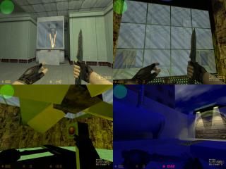
Fy_Glasshouse
Okay, guys!
This is my first ever serious map. It's nearing its completion, but I feel like I lack something. Perhaps, details. Or, perhaps, some textures. If you look close, I used the "steel" texture in alot of places, simply because I couldn't find anything beter. And I can't make textures myself yet.
I know the mapping community generally dissaproves of "fy" maps, but I honestly can't think of any better way. It's not very big, albeit difficult in geometrics, and somewhat symmetric as well...
My problems are, in order from most to least important: details, texturing, lightning.
Also, as you may notice of the screenshots and of the name, I'm a glass obsess!
Any feedback and constructive critisism are widely welcome!
3 Comments
You must log in to post a comment. You can login or register a new account.

 CS
CS


For starters there are no weapons; FY maps leave piles of guns for the players to use. This is also way more detailed/nice than 99% of any FY maps i've ever seen
The glass stuff might be interesting in a game. The stairways are kinda hard to see, as well navigating the glass maze, but maybe that was intentional on your part. I doesn't matter anyway, since you can shoot through it I guess
I like the "caverny" parts... not very fancy, but the rock parts that connect you to the glass part look really good imo.
Last nitpick, align your volumetric light properly, and make them 3D... they'll look so much better. By 3D, I mean make each "side" of the light rays out of a seperate brush. Then apply the fade texture inside and out of the beam, so it doesn't disappear when you look under it.
Very nice map, and quite spectacular for you first!
A few things to note:
1. I reccently instaled a new graphic card (Radeon x1900rx), so I got hardware confict and had to reinstall Windows, effectively erasing Steam and my unfinished map wih it. However, I remembered, that lucky me had copied the map to my USB device, so it's not as complete (no spawn points and such), but definitely just a few hours worth of work to do to restore it to this submitted piece of work.
2. Volumetric light...ahhh yes...I intended originally to do just like you said. However, it became EXTREMELY ugly. You see, all these thin brushes somehow become visible from side. It looks more like a hollow box from side, than normal illusionary light. Unless one can create brushes with 0-unit width, there's no way to fix it. The edges simply are visible through the transparent brushes. Also, you might have noticed, just on the down edge of my brushes, there is a tiny yellow line, where "fade" goes to "black". No idea how to fix it. Also, what do you mean to "align properly"? The lights on the CT base are pointing right down, so the volumetric light should point down as well.
3. FY_. No idea what to name it. Any suggestions? I can of course redo it for HLDM, but I don't fancy that game. Or maybe Sven Co-op, which I simply adore right now? Anyway, there exist some maps like mine, with a single goal of eliminating the opposing team, and at same time ability to buy weapons.
4. Glass. AH, GLASS! yes, I love glass. The stairs are made transparent for a reason. They can be broken as well, so it spices up the gameplay a bit. Although you need 10 secondary knife hits to break it, or a full round of M4A1 (or whatever). Also, I think I'll make the mid-glasses (those extra-hardy and little-trasparent) even hardier, and not transparent at all. My intention is that both teams should hae to climb to the highest floor to be able to actually fight.
5. The "caverns". Do you refer to the entrances from both the T and CT bases? Yes, I don't like them much either, but that's as far as I can go. Without a displacement tool like the one in Source, it's a little I can do without SERIOUS vertex manipulation.
6. You might have noticed, that the map features a huge fan and 2 side-rooms, in which some machinery seems to be standing. This was just to add a bit of spice to the map. The fan is strong enough to blow you up again if you fall out of the topmost floor (without jumping). And the machinery in the side-rooms gives off an industrial ambience sound when the fan is online. Just to spice the map a bit =).
Here's a picture of what I mean, of one method to achieve the 3D volumetric light:
https://sites.google.com/site/rowleybob/3dvolumetriclight.jpg
Or for more info, check out the .rmf from my compo 20 map:
https://twhl.info/vault/view/3885