aim_pistolround
 CS
CS
aim_pistolround
by
smokescreen
Posted 18 years ago2006-11-24 20:55:15 UTC •
Unfinished •
Counter-Strike
- Name
- aim_pistolround
- By
-
 smokescreen
 - Type
- Map
- Engine
- Goldsource
- Game
- Counter-Strike
- Category
- Unfinished
- Included
- BSP
- Created
- 18 years ago2006-11-24 20:55:15 UTC
- Updated
- 18 years ago2006-11-24 22:40:43 UTC
- Views
- 1064
- Downloads
- 430
- Comments
- 3
- Rating
- 2.00 (1)
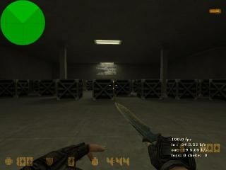
This is just a simple no buying pistol map for cs.
3 Comments
You must log in to post a comment. You can login or register a new account.


Anyway, the type of map limits this to a maximum rating of 3 stars, but i must say that it is not a bad example of the gametype.
Sadly, it still shows many of the signs of a bad map.
? repetative texturing
? crates. crates. oh, and more crates.
? blocky, to the point of injury.
? been done 1000 times before.
However, i actually quite like the simplistic lighting, so it doesn't quite sink as low as 1 star..
I strongly suggest you work on this some more.. Add some height variation.. Give the floor some interesting changes in texture, and for god's sake get rid of the crates.. Put something more imaginitive in their place.
yeah that is 640 x 480 ive always played like that and I just can't bring myself to change it lol.
Well in order for it to be blocky, there has to be some architecture, which there there is almost none
Map = A box, crates, 2 ramps, 2 pillars.
Like Hunter said though, It LOOKS ok for what it is. Would still probably be fun to play--all these types of maps are poorly mapped, but somehow they're all fun too
Also agree with Huntee about the lighting--subtle and dark over too bright/fullbright any day of the week.