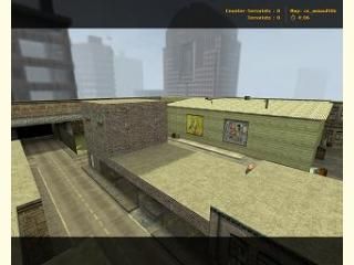
cs_assault06
This is a remake of the original Counter-Strike map cs_assault. This is my first map so please tell me what you think of it.
Enjoy
-Update 8th Jan
Enjoy
-Update 8th Jan
- Fixed Texture alignment
- Changed the lighting
- Fix some more things...
- Vents fixed up
- Sky will be fixed soon
- Fixed UP the sky!
6 Comments
You must log in to post a comment. You can login or register a new account.

 CS
CS


+its a new cs_assault
-it looked like you ripped areas from ccs cs_assault and placed into the map and changed it a bit.
-texturing in most places were not aligned.
-i found the lighting bad (too many lights inside the warehouse and not much lighting outside!)
My rating: two stars....
It looks a lot like the cs:s version! Great performance considering some of the nice detail in the level like thos stairways.
In general the texturing could be a lot better, and the lighting would look nicer with more contrast--so the shadows are more visible.
Because I suck at texturing, it's hard for me to recommend what to do, besides maybe try some new ones or try scaling them differently. Be careful not to scale them too small though, as it will make your compile time much longer not to mention your wpolies will rise dramatically.
The lighting in general is way too bright imo. If you keep it so bright, maybe use a series of sprites to mimic a HDR effect or something.
Lastly, I'd recommend a custom sky. Since it looks like cs_assault source already, why not use the sky from that. I've seen tutroials for converting 3D skyboxes to 2D for Half-Life 1, but I've never actually tried it. Here's the tutorial if you're interested:
https://developer.valvesoftware.com/wiki/Skybox_(2D)
Misc nitpicks:
- Make the concrete "french fries" inside all vertical. You can intersect them with the floor at the diagonal parts if you make them func_walls without any brush intersection problems.
- The scale in some of the intereior areas was strange. Adjust it where needed to make it more realistic.
- Some of the parts inside are too thick or too thin inside. The HVAC vent looks too fat for example. Your light fixtures look way too skinny, and it's supports look too fat
 Take some more time to make your detail items proportion/scale look real in-game
Well I hope you keep working on it! This maps worth between 3-4 imo at present. Please pm me with updates, and I'll rate it when it's more finished!!1