xdm_capsule2
 HLDM
HLDM
xdm_capsule2
by
rend0us
Posted 18 years ago2007-02-17 15:23:47 UTC •
Completed •
Half-Life: Deathmatch
- Name
- xdm_capsule2
- By
-
 rend0us
 - Type
- Map
- Engine
- Goldsource
- Game
- Half-Life: Deathmatch
- Category
- Completed
- Included
- BSP
- Created
- 18 years ago2007-02-17 15:23:47 UTC
- Updated
- 18 years ago2007-02-17 15:23:47 UTC
- Views
- 1834
- Downloads
- 849
- Comments
- 5
- Rating
- 3.00 (1)
- Reviews
- 0
took a toatle of five sittings, to create this map..comments or ratings are welcome..peace $1REN
addcrue.com
addcrue.com
5 Comments
You must log in to post a comment. You can login or register a new account.


- No discernable theme
- Item placement (This really killed it. Health, batteries and RPG's EVERYWHERE you turn)
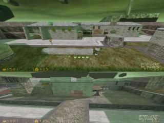
- Odd choice of textures (What was this, a castle on Xen?)
- I suppose the lighting works with the Xen theme, but not with the textures you chose.
+ Fucking rad Jesus HEV suit charger
+ Crossbow sniping point on the roof was nice
+ Some decent brushwork
Decent map overall, but like I said, the item placement is downright TERRIBLE. And you get 1000 points cause I lolled so hard at the Jesus charger.
I like the green lighting a lot, I think it makes the map unique and easy to remember. Item placement seems strange. Weapons with a lot of ammo nearby, a bunch of healthkits together... is this for something other than normal deathmatch?
In terms of architecture, the map really suffers. Your textures look convincing, but the enviroment they are in is mostly empty and most surfaces look boring. I think the map is much bigger than needed. Maybe it has to do with the long-range gameplay you had in mind, in which case you kept a good performance level in the map.
Some indoor lights were good, but others seemed redundant (room with the circle-typle texture in the floor tiles)
Having played most of your maps, I think you should concentrate on building smaller rooms and detailing them more, since a lot of areas in your maps end up being too empty.
I like the layout. Even though it's bigger, more intricate, and more wide open than I usually like, there's still plenty of cover, and I felt I learned the layout very quickly--I guess that means good landmarking on your part :0
I like the textures and the overall feel of the map. While I think you could use more detail in general, more vistas, and some fancier architecture--like those painfully square doorways--, the maps superbly-low wpolys would suffer as a result.
That said, some excellent detail in the multi-breakable windows, that bridge, and some other things were really nice. I also LOVED the CHRIST CHARGER!!1
As a nitpick, maybe add sounds to the doors, and some other local sounds in general.
Anyhoo, great map! You should get this on Muzz's server so we can see how the gameplay is!
another familliar face. every one loves the christ charger ahah..see you guys soon peace..