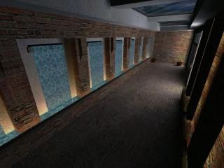
The Pool - Compo 23
 HL
HL
The Pool - Compo 23
by
alexb911
Posted 17 years ago2007-03-17 18:14:02 UTC •
Completed •
Half-Life
- Name
- The Pool - Compo 23
- By
-
 alexb911
 - Type
- Mod
- Engine
- Goldsource
- Game
- Half-Life
- Category
- Completed
- Included
- Mod files
- Created
- 17 years ago2007-03-17 18:14:02 UTC
- Updated
- 17 years ago2007-03-17 18:14:02 UTC
- Views
- 4414
- Downloads
- 1416
- Comments
- 9
- Rating
- 5.00 (1)
- Reviews
- 0
The Pool - Compo 23 Entry - ALEXB911
This is my entry to Compo 23 - with a very original title! Although mostly complete (I could have done more outside) it does show some max entity errors in dev mode which resulted in some features not appearing correctly - ie, the outside water feature and the glass walls.
Purely cosmetic, although on entering the indoor area there is a button on the left by the wall light - press and turn around to face the pool - I won't spoil the rest!
MOD FORMAT - with custom menu .avi title
(approx. 5.5mb external host)
Let me know what you think - Thanks!
9 Comments
You must log in to post a comment. You can login or register a new account.


The HL2 textures look good, but the default water texture you chose is actually horrible...
Some tips.
*When making a waterfall, make the scale of the texture in the Y axis a bit higher, to give it a good distortion and sense of speed.
*When making a multiple-brushed waterfall, use alt+right-click to give each brush the same alignment values. In some parts of the mini-waterfalls, some segments had the water moving in a different direction!
+ Anyways, besides all that the map was pretty neat. The splashes coming from the waterfalls was a realy great touch. I realy liked the small waterfall coming from the spa. For a big pool area, i could say you pulled it off.
The waterfalls at the beginning did have sound, strange that they didn't work for you though. The glass was also one of the issues I had with the max entity limit, and grouping them didn't seem to help. I agree about the swimming pool depth - i thought about that at one point but completely forgot to take it further.
If I have some spare time, I might work on this some more, and maybe try and show off some more of the HL2 textures.