Quarintine v1.1 beginning
 HL
HL
Quarintine v1.1 beginning
by
trooperdx3117
Posted 17 years ago2007-04-09 17:46:11 UTC •
Unfinished •
Half-Life
- Name
- Quarintine v1.1 beginning
- By
-
 trooperdx3117
 - Type
- Map
- Engine
- Goldsource
- Game
- Half-Life
- Category
- Unfinished
- Included
- RMF/VMF
- Created
- 17 years ago2007-04-09 17:46:11 UTC
- Updated
- 17 years ago2007-04-09 17:46:11 UTC
- Views
- 5523
- Downloads
- 994
- Comments
- 4
- Rating
- 4.00 (1)
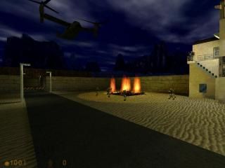
These two maps are my new beginning for my Quarintine update post your comments and tell me what you think also ignore the trigger_changelevel at the end of the third level
note: these maps require the opfor wad
note: these maps require the opfor wad
4 Comments
You must log in to post a comment. You can login or register a new account.


From what I've seen, the idea looks nice. I haven't compiled to test it in-game, that's your job after all, so I can't say much more on that. I should note that the level does look quite blocky, you may want to use some more angled rocks and generally, more natural shapes for the whole surrounding. I noticed you already slanted your rocks a bit, but the overall area is still very square. That's something I'd change if I were you.
Technically, there's a few things, such at the edges of the burning 'pool' that stick out. Read up on the clipping tool or the vertex manipulation tool if you want to tidy that up. I also noticed your maps are 'skyboxed': there's a big skybox arount the whole level. That works to prevent leaks, but the bottom of the sand and several area's that you will never see get compiled with the map, which takes some extra time and pushes your map to limits faster. Usually, people will create a more complex skybox, so, that only visible parts of the level are contained within it.
Nonetheless, it looks good so far. There's various things to improve on but that's ok. Good luck with this.