Terrorist
 HLDM
HLDM
Terrorist
by
Darth Sailor
Posted 17 years ago2007-04-17 22:24:30 UTC •
Completed •
Half-Life: Deathmatch
- Name
- Terrorist
- By
-
 Darth Sailor
 - Type
- Map
- Engine
- Goldsource
- Game
- Half-Life: Deathmatch
- Category
- Completed
- Included
- BSP
- Created
- 17 years ago2007-04-17 22:24:30 UTC
- Updated
- 17 years ago2007-04-18 13:08:47 UTC
- Views
- 1730
- Downloads
- 699
- Comments
- 9
- Reviews
- 0
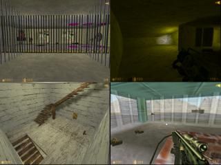
Basically it's an Anti-Terrorist Training Facility for HLDM. Four different situation areas with an observation tower in the middle. The crates do blow up with quite the affect. Below the map is a prison where you can see other players movements on two maps mounted on the walls. There's a combination lock to get in there though. The number is displayed as you go down through the floor of the middle building(40687).Shoot one of the maps and you can place other players in jail. Shoot the other map and you warp to that area. A few more secrest here and there. Hopefully people are having fun playing it.
9 Comments
You must log in to post a comment. You can login or register a new account.


Although, from the screenie, the texturing looks semi-decent, as well as semi-decent brushwork, and decent entity usage (if it does what u say i does), but the outlay looks horrible, its just a square with a bunch of houses. No originality, no creativity, no interesting architecture, no theme; thus no interest to download.
The problem with this is, most multiplayer maps for HL1/CS1.6 don't get played these days, unless they're really significant or well made. The only other reason people will download it is if it looks good. This is especially true on a mapping site, where you don't find too many people who are exclusively interested in the gameplay. The graphics are one of the biggest parts of mapping, and the only part of a multiplayer map you can experience on your own.
That being said, this is nowhere near the worst map I've seen here. You did something right by having the nice angled lighting, but it is a bit bright. The texture on that outer wall is extremely repetitive too, so it doesn't work very well on large surfaces.
Although he does make valid points, they hardly apply to this map, which really shows some potential.
You should read up on the Mapping Tips thread.
It has loads of useful tips about improving architecture, texturing, and overall brushwork.
You have much potential. Lets see how far you can go.
Thanks again.