dm_particle
 HLDM
HLDM
dm_particle
by
Taylor
Posted 17 years ago2007-11-11 07:06:14 UTC •
Completed •
Half-Life: Deathmatch
- Name
- dm_particle
- By
-
 Taylor
 - Type
- Map
- Engine
- Goldsource
- Game
- Half-Life: Deathmatch
- Category
- Completed
- Included
- BSP
- Created
- 17 years ago2007-11-11 07:06:14 UTC
- Updated
- 17 years ago2007-11-11 07:06:14 UTC
- Views
- 4917
- Downloads
- 1228
- Comments
- 6
- Rating
- 5.00 (2)
- Reviews
- 0
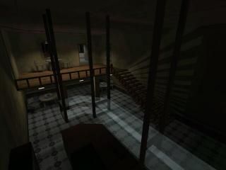
My entry for compo24. I originally wanted to make a highly interactive map, where you could shoot out pieces from walls, break every table and chair, but as I made like two rooms with such complexity, the r_speeds started hitting 1000, so I abandoned the idea. I based the theme of the map on the movie "Hard Boiled", so that's why the map was supposed to be called dm_particle, referring to the flying particles. I sticked with the name and the theme, but not with the flying particles, unfortunately.
6 Comments
You must log in to post a comment. You can login or register a new account.


Where it's not too dark, the lighting is good. I like the sprite-illusions of light glare that you've put on appropriate lights. And those stairs (which you can see in the screenshot too) look lovely.
A good level of detail throughout.
Some sound ambience, but lacking in some areas. Once again though, put some gunfire in and you probably would never notice.
Judging this compo looks like it's going to be tough!
+ Textures were nice, I don't think I recognized them.
+ Layoutlolzorz.
= Maybe a bit too dark. I had to flashlight to get around sometimes.
= Exit signs could illuminate the doors. I couldn't always find them or know if they opened.
- Not enough ambience. An easy fix for interior spaces with not much going on is to take the exterior sounds and and muffle them out. Gives the place a depthy feel.
One of my more favorite maps of the compo entries for gldsrc.
Ambience: That was the last thing I was adding to the map, and didn't have enough time, to tweak around with it for too long. Not much of an excuse, but true.:)