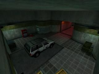
dm_Armazenamento
 HLDM
HLDM
dm_Armazenamento
by
Ansith
Posted 17 years ago2007-11-15 05:44:49 UTC •
Completed •
Half-Life: Deathmatch
- Name
- dm_Armazenamento
- By
-
 Ansith
 - Type
- Map
- Engine
- Goldsource
- Game
- Half-Life: Deathmatch
- Category
- Completed
- Included
- BSP
- Created
- 17 years ago2007-11-15 05:44:49 UTC
- Updated
- 17 years ago2007-11-15 05:44:49 UTC
- Views
- 4132
- Downloads
- 960
- Comments
- 7
- Rating
- 3.67 (3)
- Reviews
- 0
An old HLDM map of mine from a Year ago, Updated and Re-Uploaded.
Thanks to FresheD, who also took part in early development of this.
Thanks to FresheD, who also took part in early development of this.
7 Comments
You must log in to post a comment. You can login or register a new account.


It's cool that you've actually added a wee bit from everything in HL (transit system, machinery, xen flora even!), which, combined with the ambience gave for an interesting, familliar feeling. Architecture, texturing and lighting was clean, but about average almost everywhere. Nothing too spectacular.
Weapon placement was pretty good, the layout - plain and simple.
What a map as small as this lacked was interactivity. None of the buttons/levers throughout the map did anything. Some traps, or puzzles would've been fun.
What amuses me the most is the name (even if there's no connection between it and the map). A clever way of making something dull in english sound fancy and exciting.
Overall - I liked it. Nice easter egg(?) too.
If you actully found it with use of the button, well nice work.
I'll update this again soon, I'll add a few traps and stuff as you mentioned.
And thanks for the Comments and Ratings.
.. or is that just something you've overlooked?
Thanks.
Screeneh
Seemed too funny to be a coincidence. :>