Space Tempest M35
 HLDM
HLDM
Space Tempest M35
by
Sajo
Posted 16 years ago2008-11-01 08:36:25 UTC •
Completed •
Half-Life: Deathmatch
- Name
- Space Tempest M35
- By
-
 Sajo
Sajo - Type
- Map
- Engine
- Goldsource
- Game
- Half-Life: Deathmatch
- Category
- Completed
- Included
- BSP
- Created
- 16 years ago2008-11-01 08:36:25 UTC
- Updated
- 16 years ago2008-11-01 08:36:25 UTC
- Views
- 3150
- Downloads
- 1023
- Comments
- 11
- Rating
- 4.50 (4)
- Reviews
- 0
-Space Tempest M35-
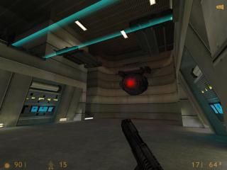
A Half-Life: Deathmatch map which takes place in a spaceship called M35.
I actually wanted to add more detail and entities but VHE didn't allow it.
Have fun.
Other Download Link:
http://files.filefront.com/Space+Tempest+M35/;12219506;/fileinfo.html
A Half-Life: Deathmatch map which takes place in a spaceship called M35.
I actually wanted to add more detail and entities but VHE didn't allow it.
Have fun.
Other Download Link:
http://files.filefront.com/Space+Tempest+M35/;12219506;/fileinfo.html
11 Comments
You must log in to post a comment. You can login or register a new account.


I like your fine ambience and lighting, and also, good use of submerged.wad !
It proves to be a type of map where the architecture is not dead(like just a place were you battles are made),instead in influences the combat in many different ways.Plus, the "technology" add to the walls greatly improve this .
.
5 stars
Well i supose your right, but it didnt have that extra thing that makes us go "wow" unlike your xen mod
edit: I found some texture mistakes and a brush that isn't connected to the wall. I'll fix them tomorrow.
I can definitely see you recycling your architecture from Xen Assault, which I'd hate to call a bad thing, as it mostly looks very nice. Most larger, more open areas still lack detail. Add supports, trims, pipes, gadgets - any of the usual stuff to spice them up. Ignoring that, brushwork is pretty great. The rotating lazer, spaceship and red eye orb were very nicely crafted.
Texturing was alright, no serious flaws - it served its purpose.
Ambience I didn't pay too much attention to (played with music the whole time), although most areas seemed to have consistent background sounds, which is a good start.
Gameplay - wise, I liked all those small traps, etc. It was quite fun, even with all that lag. Chokepoints were all well-connected, layout was simple enough for everyone to have some decent fragging. Think about somehow implementing that orb-of-death trap, too.
Lighting was somewhat bland, especially in the main areas. I'd give it a bit more colour variation, as well as brightness.
Overall, a nice map. Still needs work, though I'm giving it 4* in advance, hoping you'll improve things. :>
also i agree with daubster, lighting is dull and its hard to see other people in some areas without flashlight on :s
++superb detailing and skillful detail geometry
+great detail contraptions
+Neat effects like the platforms, "warp" effect and many others
+great use of ambients but map is so big i'm sure could use more
*texturing ok but needs work in many areas
*r_speeds are playable in most areas but very high in some too
*lighting is sufficeint but has rounded edges from using pointlights (i always prefer texture lighting because i think it looks more natural)
-map as a whole is a bit big and blocky for a spaceship imo
-
The detailing and "extras in this map are really impressive like the nice, rounded main view window, all the consoles and buttons, and other things you used to break up coridoors and such. The shuttle looked amazing as well as the nicely-styled hallways running through the middle and ends of the map. Sound is great and really adds to the map when you have something to listen to. it gives the map more realism and dimension. Finally the moving contraptions like the hammering thing and the tram of boxes going through the forcefield was nicely done (though i would have shaped the boxes more rounded like a futuristic-looking tote rather than just a big box. you should also be able to ride them, lol = )
My biggest and really only bone with the map is the main structure of the ship, which is very huge and quite blocky. Space should be utiized well in any room or structure, most especially a spaceship. (there is nothing wrong with making a mammoth, star wars-type ship, but then it becomes your problem to fill up the areas with meaningful detail)
I think a redesign of the bigger areas somehow truncating them, and some rounding off of a lot of the more squarish stuff would really do this map some good. I like the main layout of the map from a 2-d perspective and the vertical relief is fine, it just needs to be confined to individual rooms imo, if you know what i mean.
Anyway, mad sajo + space theme + cool effects = 5 stars in my book, though i think you could still make the map a lot better. Bravo = )
* * * * *