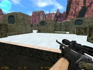
awp_glif
It's simple awp map that I finished today...
I think it's look prety good and gameplay also prety good so download the map and go to kill someone ;D
Sorry i dont know how to add more screens
More screens:
http://www.mapping.xz.lt/uploads/awp_glif0003.bmp
http://www.mapping.xz.lt/uploads/awp_glif0004.bmp
I think it's look prety good and gameplay also prety good so download the map and go to kill someone ;D
Sorry i dont know how to add more screens

More screens:
http://www.mapping.xz.lt/uploads/awp_glif0003.bmp
http://www.mapping.xz.lt/uploads/awp_glif0004.bmp
7 Comments
You must log in to post a comment. You can login or register a new account.

 CS
CS


And the default skybox texture really needs replacement.
And finally, try uploading jpg screenshots next time. Jpg's are smaller, and load a lot faster.
in this screen you should see that this is not a fullbright (look near the box)
http://www.mapping.xz.lt/uploads/awp_glif0003.bmp
For the default skybox texture:
If i will find something with snow i will replace
next time screens will be in jpg
Misplaced brushes, bland lightning and ambience.
And on top of that, an awp map.
- Some of the brushes and textures aren't aligned perfectly and there are missing brushes near two of the staircases. The lighting is boring and the map lacks ambiance.
+ I like how you added depth to the walls so they aren't just flat and neither is the ground. The layout is interesting and not just a long hallway with pillars to hide behind like the older awp maps. It appears that you made half of the map and just copy pasted then rotated it. I would have like to see a few differences on each side of the map for varied game play.
Fix up some of the errors and I give this map a 3.
++color scheme (snow looks nice on those textures)
++general layout/design is really good looking imo
++good brushwork besides the arch errors and some other small things
A couple small changes would make this map tons better:
-HLFix would probably fix those arch errors, or you could just design them a little more carefully
-instead of making the "snow hill" one plane, break it up into more segments, to give a more rounded, natural snow look.
-christ sake get rid of that desert sky texture
Besides those things, this is great for an awp map. a 3 at the very least, a 4 if you fix the above problems..
Nice map = )