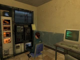
First source map
 HL2
HL2
First source map
by
Notewell
Posted 15 years ago2009-12-22 21:29:57 UTC •
Unfinished •
Half-Life 2
The first actual source map I've made (actual meaning having more than 8 minutes with the editor and not on someone else's computer)
I've utilized some of the better features, such as cameras, physics, func_breakable_surf, soundscapes, and 3D skyboxes. It's not my best map detailwise, or geometry wise, and it has no combat, but I think it's pretty good for an engine that I'm just starting out with.
Lots of feedback, please!
I've utilized some of the better features, such as cameras, physics, func_breakable_surf, soundscapes, and 3D skyboxes. It's not my best map detailwise, or geometry wise, and it has no combat, but I think it's pretty good for an engine that I'm just starting out with.
Lots of feedback, please!
5 Comments
You must log in to post a comment. You can login or register a new account.


Shows a good understanding of some key Source entities. Like all mappers transitioning from GldSrc to Source, you need to use solid props in harmony with brushwork as opposed to just filling box rooms with items.
Lighting was the weakest point. Use light_spots more than regular light entities, and lower the lightmap grid to generate some nice shadows.
Oh, and the outside bit at the end didn't have a cubemap, so it still used reflection information from the garage/warehouse.
Clicky.
Good start.
Drunk Barney wins you points, but I won't rate until it's more finished.
The next thing I'd focus on is more advanced geometry. Trims around doors, windows and ledges. And angled and curved buildings.
Is it just me or do the birds outside act totally spastic? Flying up a bit then giving up and falling back to the ground in their standing pose, then starting over? It's hilarious. Like Hitchcock's "The Birds" or something.
Yeah, for some reason they only use the first two levels of hint nodes, even though there are 3-4 higher levels of them.
"the outside bit at the end didn't have a cubemap, so it still used reflection information from the garage/warehouse."
I'm aware of this, I didn't think anyone would be checking the cubemaps. Guess I was wrong.
"Use light_spots more than regular light entities, and lower the lightmap grid to generate some nice shadows."
Okay, I'll look into that.
"The next thing I'd focus on is more advanced geometry. Trims around doors, windows and ledges. And angled and curved buildings."
Okay, I'll look for suitable textures for those and use them in the map I'm working on now.
I likely won't be finishing this map any further. It was good for learning, but it's not all that interesting, especially now that I've taken out the super-grav gun.
The stairs. They use the same texture on the front as they do on the top.
http://www.file.si/files/3pcir8tgkzmntsrwzw4a.jpg
Somehow, that just doesn't feel right. Other than that, this map is very well done.
To my knowledge it seems thoughtfully detailed and arranged, and quite a decent size for a first map.. Bravo! =)