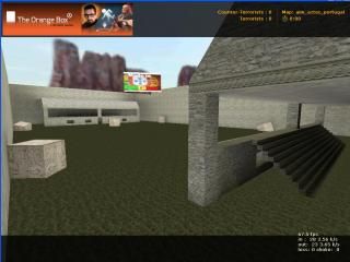
aim_aztec_portugal
 CS
CS
aim_aztec_portugal
by
T3RM1N4T0R :D
Posted 13 years ago2011-03-19 16:58:18 UTC •
Completed •
Counter-Strike
- Name
- aim_aztec_portugal
- By
-
 T3RM1N4T0R :D
 - Type
- Map
- Engine
- Goldsource
- Game
- Counter-Strike
- Category
- Completed
- Included
- BSP
- Created
- 13 years ago2011-03-19 16:58:18 UTC
- Updated
- 13 years ago2011-03-19 16:58:18 UTC
- Views
- 1543
- Downloads
- 548
- Comments
- 14
- Rating
- 2.33 (3)
- Reviews
- 0
Map by T3RM1N4T0R 
It's my 2nd map

It's my 2nd map
14 Comments
You must log in to post a comment. You can login or register a new account.


Why is there no detailing at all?
What makes this map unique in any way?
Why does this have 'Aztec' in the name?
helpful hint:
Don't release maps which only took 20 mins to make. If you can literally count the number of brushes in the screenshot - it's not finished.
Codex - Pieces of paper used to record events
Nuahlt - Their language
Conquistador- A Spanish soldier that spread through the land seeking conquest
Therefore, I hate this map.
Also how the hell did he rate twice?
Also, you just lost the game.
That said, texuring is awful, and the "arena" part of the map is essentially a rectangular box. There is no interesting cover in-between sides, actually, there really is no cover at all besides 2 crates; this is bad. Theme is not well-developed, and really has nothing to do with aztec map.
For what it is (remember, we're talking about an "aim" map here, it's really not altogether that bad. Not a bad beginner map, and i rate 3 stars for an excellent equip system.
NOTE: People rating the map without even downloading/playing the map: Unless your psychic, it is IMPOSSIBLE and simply improper to critique/rate a map through a screenie. /end mini rant.
...It is weirdly addictive!
Cap. Terror was correct though. It is a cool equip system. It's like a vending machine from heaven
Though other than that, the map was sort of boring due to the lack of anything in the middle.
It's cool. Worth checking out!