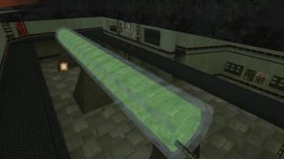
Harvester
 HLDM
HLDM
Harvester
by
X-LAyer2
Posted 13 years ago2011-04-16 17:10:25 UTC •
Completed •
Half-Life: Deathmatch
- Name
- Harvester
- By
-
 X-LAyer2
 - Type
- Map
- Engine
- Goldsource
- Game
- Half-Life: Deathmatch
- Category
- Completed
- Included
- BSP
- Created
- 13 years ago2011-04-16 17:10:25 UTC
- Updated
- 13 years ago2011-05-11 00:54:05 UTC
- Views
- 2251
- Downloads
- 666
- Comments
- 6
- Reviews
- 0
Includes a HLDM version and an Opposing Force version
A map roughly based around the Metroid Prime Hunters maps "Harvester" and "Incubation Vault."
I started working on this quite a while ago then it just kinda sat there on my hard drive for about 2 months until I decided to finish it. At first i wanted to more of an exact remake of "Harvester" as I did with "Combat Hall" but I changed my mind, and made it more my own personal style while at the same time combining it with another Metroid Prime Hunters map I wanted to do which is "Incubation Vault."
Comments, ratings?
Play this map on the Opposing Force server "Ooks 2600 maps." Just "rockthevote" then type "vote op4_harvester"
6 Comments
You must log in to post a comment. You can login or register a new account.


As for complaints fisrt of all in such a small map texturing should be better alligned. As for the grate cat walks it looks odd with the grating continuing around the edges. As a personal taste I really can't stand the metal walk sound and for such large surface such as the floor I would probably remove the sound by renaming the texture. It just sounds hollow and fake. The ladder was also strange how it dead ended and you have to jump from it to reach the highest area.
The map had some wind ambience but could have used some more. The two seperate areas were close enough to see eachother and should have been placed further away in the void to avoid this. The overall map was pretty blocky and could have been a little more appealing. You could add more trims and texture variations to edges. Windows could use trims. The direct metal to glass connections looked somewhat odd and fake. And the entire thickness of some of the glass looked somewhat odd.
Lots of things could have been done to make this map look a lot nicer. But it would be pretty fun and overall its a pretty neat small map.
This is pretty good for your first dm map but to "finish" a map takes a great deal of time figuring out every detail because imo one error affects the entire map.
EDIT: updated
A couple notes/nitpicks:
-one of the ladders in the "harvest" area(by the big green capsule" doesn't work. (i really like that area btw)
-might be a funny salute to cs_assault if you make those monitor banks by the health chargers (harvest area) trigger_cameras. =)
-i would avoid using the stock HL glass texture in most cases, becasue personally, i just don't like the way it looks. remember you can make ANY texture look transparent..(sure you know that just saying, another texture might look better)
-I would add lots more small detail items pretty much everywhere in the map, since it also seems you have room in your wpoly budget. For example, i'd add all kinds of wires and stuff attached to the green capsule/tank, and get creative with floor/ceiling/wall trims.
Nice stuff1 would like to play it on a server! =)
EDIT: Fixed the ladder, and also fixed a broken spawn.